
So, Sway.
It has been positioned as something between PowerPoint (beautiful presentations) and SharePoint pages (easy newsletters). Sway can be found between your Microsoft apps – it is available for both your free Microsoft account and it is included in the Microsoft365 suite.
I like the idea of Sway, but since it has become so easy to work with both PowerPoint and SharePoint, I wonder what it’s use is. So, when I had nothing better to do 😉, I decided to find the benefits of Sway.
In case you are new to Sway, or want to learn how to use it, you may want to watch this video by Kevin Stratvert.
Paid or free – is there a difference?
My first question is if there is any difference between the business (Microsoft365, paid) and the free version?
I created a simple Sway in my Microsoft 365 tenant. I did not use a template. This is what the edit (Storyline) screen looks like:

I then created one in my personal Microsoft account. I used Firefox browser to make sure there is a separation between the two accounts. (Edge has a tendency to mix things up). The Storyline part looked the same, so I clicked on the Design button top left. This was the result:

Trust me, this is the same as the paid version.
You see there is a warning at the top that from May 15, 2024 you will no longer be able to upload your own videos or audio files, but will have to work with embedded videos, so videos living on “other platforms”. Hope that is not an issue for anyone. I have removed that message from further screenshots.
What can I do about the look and feel?
If you click on the Design tab, and then on “Styles” top right, you will get a number of options:
- You can select whether the direction of your presentation is vertical, horizontal or slide
- You can customize colours, fonts and textures – more about that later
- You can click one of the buttons below and get a surprise look-and-feel (I assume over time you will know what’s under which button). There are some clues, such as background and letter colours, and typeface.
- Or you can remix (top left) for a completely “random” look and feel
I clicked “Remix!” and now my business Sway has suddenly turned into a knitting pattern or recipe 😱

I have the same set of styles to use for my free Sway. I chose a horizontal style, which looks a bit more compact than the vertical business one.

Can I apply my house style?
Communication and Marketing peeps will want to know how how to create all messages consistent in look-and-feel. I asked CoPilot and apparently you can freely choose colours, but you are limited to the existing typefaces. That is a bit of a bummer.
To see what can be done, let’s click on the Customize button in the Design pane.

If you click on the colour button you can add a colour of choice; let’s go for #C133FF, a hot pink/purple.

Your available colour palettes will change to the uploaded colour. I chose the most right one and well, that is impressive! (NOT)

All appears to be dependent on the selected style button, so you can play around with it to find one that changes the background or the letters into the desired colour.

On we go. Below the palette you can select from 22 typeface combinations. And as much as I love all things Charles Rennie Mackintosh, I do not think that many organizations use this for their house style.

This one is also very nice, but unsuitable for most businesses, unless you sell gothic novels or create horror movies.

Fortunately, there are some good combinations, but still they may not be your company typeface.

At the bottom you can change font size and something about animations.
As for the front image, you can of course ask people to use one certain image, but there is no option to make it the default. You can save a Sway as a template, but that is personal.
The free version behaves in exactly the same way.
So, after a long check, the answer to this question is NO. You can not use your corporate or brand style.
What happens when I share?
If you click the Share button top right business and free Sway are really different.
Business

This gives you the option to share with 3 audiences (specific people or groups, people in your organization with the link, or everyone with the link).
The URL is generic, it does not show any hint of your tenant name.
You can also allow people to edit.
When you select “everyone”, it will be a public Sway and people will also be able to share to Facebook, Twitter or LinkedIn.
(Twitter? That has been X for more than a year and a half, right?)
You can create a visual link, which is a picture with the introduction text, that you can paste into an email.

You can also embed it on SharePoint. But why you would not create the content directly on SharePoint, is beyond me.
Under “more options” you can set a password and make the share buttons visible. You can also change the Share settings, which means you create a new link.
Free
You can only share your Sway with the whole world. Additionally to the visual link and embed, you can share to social platforms.
Again, you get a very generic link but I expect that with the free version.
The “More options” are the same as for the business version.

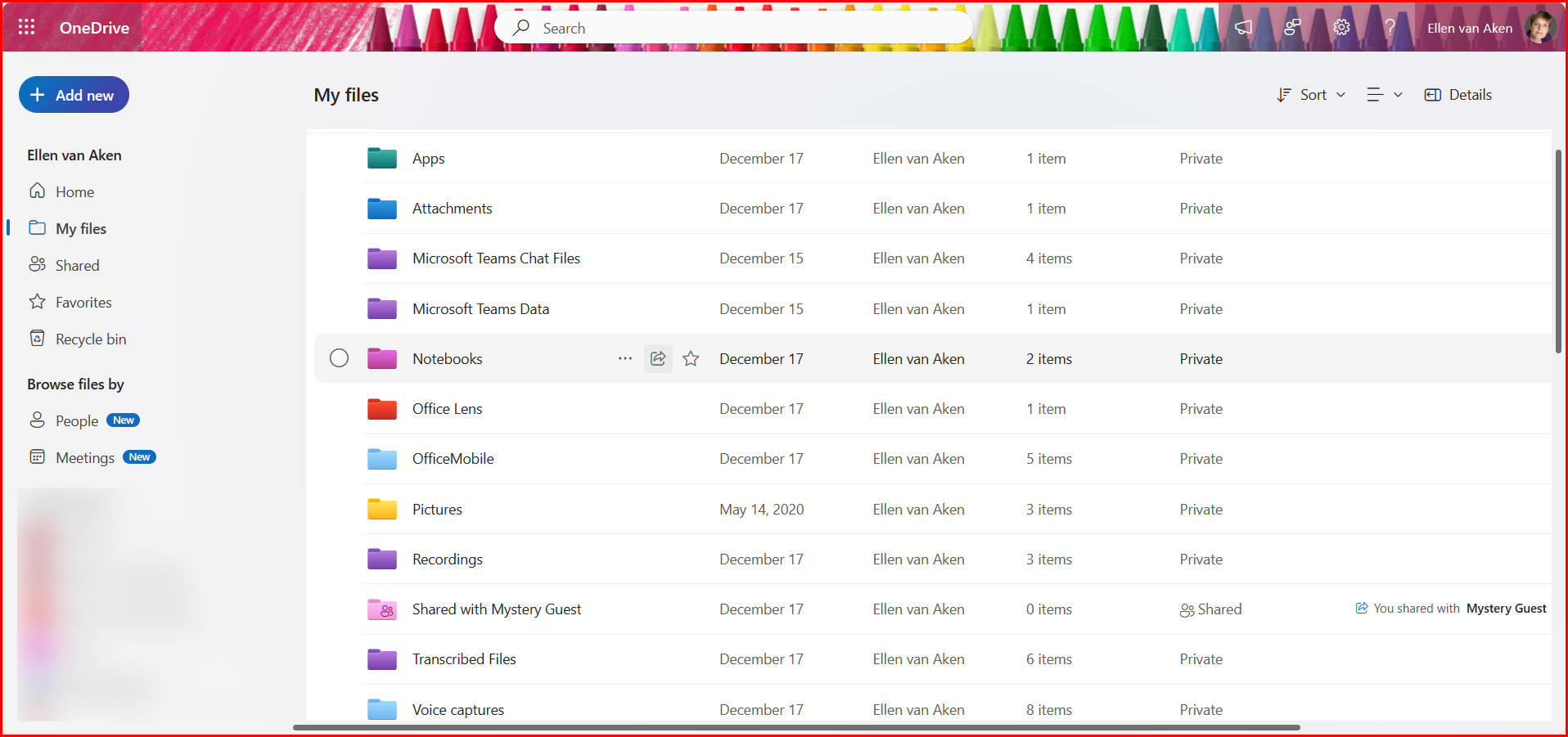
Where do my Sways live?
Your Sways are personal and live online in your Sway app. You can also see them mentioned on your Microsoft365 homepage.
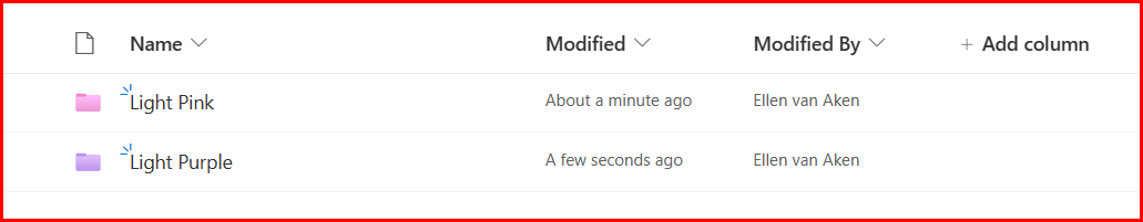
This means that if you want to create a repository of Sways for your organization, e.g. weekly Newsletters, you will need to store them manually in SharePoint for easy distribution. That can be done in document format in a Document Library, or in a Links List.
This also means that any important Sways that are shared in the business need to be handed over before the author leaves the organization. 😱
Can I turn a Sway into a document?
Yes, you can export it to Word or PDF. If you click … top right of your Sway, you can select this from the menu.

However, this does not always export the colour and typeface correctly. Below and example of my business sway as PDF, where the typeface is suddenly italic and the colour blue instead of hot pink.

It downloads to your PC so you will have to upload it to OneDrive or SharePoint.
You see from the menu above that you can also print (e.g. to PDF – this also changes the design) or save this Sway as a template. But the template is for yourself, not for the organization.
How do I keep a Sway for later?
If you want to revisit a Sway, you should be able to find it under the “Viewed” tab.

If you expect to have many Sways, you can also make them a favourite on your Microsoft365 homepage. In the paid version of Microsoft365, there’s a new Tag option which might help you keep things together.
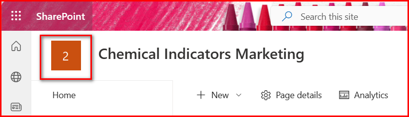
By the way, do you see how much the Sway icon (the top 2 in the screenshot below) looks like the SharePoint one? (bottom of the screenshot). Confusing!
(But not if you use the free version, as that does not have SharePoint)

How do I hand over a Sway?
When you leave the organization, you may need to handover any important Sways that need to stay in the organization. Otherwise your Sways will be lost after removal of your account. Here’s how – thank you, CoPilot!
- Share the Edit Link:
- Open the Sway you want to transfer.
- Click on the “Share” button (usually located in the top-right corner).
- Choose the “Edit” link option.
- Copy the provided edit link.
- Share this link with the person you want to hand over the Sway to.
- Recipient’s Actions:
- The recipient should open the edit link you shared.
- They’ll be able to edit the Sway as an author.
- If they only need to view it, they can do so without editing.
- Remove Yourself (Optional):
- If you no longer want to be associated with the Sway, you can remove yourself as an author:
- Open the Sway using the edit link.
- Click on the “Edit” button.
- Go to the “Authors” section.
- Remove your name from the list of authors.
- If you no longer want to be associated with the Sway, you can remove yourself as an author:
What do I think?
To be perfectly frank, I fail to see the use for business purposes:
- You can not enforce a house style. You can add a colour, but not use your own typeface. I think this is a major issue for organizations where corporate branding is important.
- Sways live in the creator’s Sway app, so any series that needs to be published together (e.g. weekly Newsletters) has to be published through SharePoint.
- You can print or export a Sway, but the colours and typeface may not be the same as your online Sway
- Sways are all stand-alone “things”; there is no “glue” such as a Team- or SharePoint site to hold related Sways together. There are also no company keywords to act as a binding factor.
- Sways are personal, so whenever an important Sway author leaves, they will have to consciously hand over those Sways that need to stay. Do you really think this is going to happen?
- Sharing creates a generic URL with no information scent about your organization. This is like Forms, but Forms are generally a means to an end and temporary, so it is less of an issue there.
All this screams: “USE SHAREPOINT!” I think SharePoint is so much better for sharing content. It has more robust content management and News and Newsletters are SO easy to create these days that I really do not see the added value of Sway. Perhaps for sharing Newsletters externally? No, there are better newsletter tools.
And PowerPoint has so many easy design options, and the possibility of enforcing a template in house style, that Sway is just too weak to compete.
At my last two organizations we removed the app from people’s view.
In my second organization we were afraid that people would start hobbying and producing lots of content that was not “on brand”. Also, we did not have the bandwidth to support it.
In my third organization people were not very computer savvy and did not like functionality that was “optional”. They needed more guidance. (That is one of the reasons why we introduced our News publishing guidelines)
I can imagine Sway may be a nice tool for private purposes if you do not have too many requirements for typefaces etc. But for my private use it had too many limitations. I wanted to create my “Curses for intranet and digital workplace peeps” in Sway, and wanted an image to the left or right of each paragraph. But that cannot be done; you can only select a background image, not a left or right image.
My findings are consistent with Ami Diamond’s recent question on LinkedIn. He asked about the similarity of the SharePoint and Sway icons and many replies were: “I do not know Sway” or “I do not use Sway”.
But then, Dean Martin liked to Sway so it cannot be all wrong! From this video, it even looks as if he used it for the lyrics! 😁😁 Oh no, Sway does not do animations 😉
What do YOU think?
What are your thoughts on Sway? Do you, or your organization, use it? Are you happy with it? If so, let me know what makes this a good tool for you!


 Ellen's Digital Workplace