One of our teams is using a SharePoint list to capture the goings-on in their department during each shift.
At the beginning of each shift they create a new list item, add info for date and shift and the name of the person in charge and save the item. During the shift they edit the item, adding all the things that need to be captured for later and/or handed over to the next shift. Generally they are quite happy as the list is less work to update and easier to search through than the Word document they used beforehand.
However, they noticed a few things:
When they used interpunction, such as ; or : the results often ended up a bit weird, especially when they were editing an item (e.g. to add something to the list during the shift)
They could not list items properly in a text field. They can add something on a new line while writing, but the end result is one large text without any indentation.
I asked him to show me his issues during a Teams meeting. He shared his screen and I noticed the issues.
I checked the list setup. As it turned out, almost all columns were multiple lines of text (MLOT), Rich Text. (RT)
Rich Text (RT) promises more options than Plain text, yet is easier to work with than Enhanced Rich Text.(List Settings side)
I have always preferred Rich Text, as it has slightly more options than the plain text, while being less cumbersome than the Enhanced Rich Text. That one has more design options, but needs an extra click to access. You create this Text field after creating the MLOT as Plain Text or Enhanced Rich Text, and then editing the column in the List Settings. (The option is not available when you create the column, and only available in the List Settings)
When you create a column (List side, shown here, OR Settings side) you can only choose Plain Text or Enhanced Rich Text.
I set up a test with three multiple line of text columns, each with a different configuration, and off I went. The strange thing is that I remember that a MLOT in RT always had a few formatting options, but the entry field looks exactly like the Plain Text.
The Rich Text looks and behaves exactly like the Plain text, even when you add and select some content. No formatting options whatsoever.
However, when you save the entries and check what it looks like , the RT field looks different than the others, and indeed, the behaviour is as described.
The Rich Text displays differently than the Plain and Enhanced Rich Text. It does not align texts properly.
Addtionally, when I edited Experiment 2, you see the : behaves strangely:
Strange behaviour with this : in Edit mode. It looks OK in view mode.
Additonally, when I checked the configuration of the Rich Text column from the List side, I noticed that the “Enhanced Rich Text” option was selected. When I pressed “Cancel”, nothing happened, but when I clicked “Save” the columns changed into Enhanced Rich Text. It is not relevant for this case, but it confirms that there is something strange with this option.
The option appears to be already on, but not really implemented until you click Save.
The solution
You might have guessed: I changed all Rich Text fields to Plain Text, as that is sufficient for their needs and behaves a bit better.
Does anyone know if my beloved Rich Text is going away? As we are moving more towards configuring from the List page rather than from List Settings I am afraid so. I could not find anything about it, but if I have overlooked something, please let me know!
About SharePoint Holmes: Part of my role is solving user issues. Sometimes they are so common that I have a standard response, but sometimes I need to do some sleuthing to understand and solve it. As many of my readers are in a similar position, I thought I’d introduce SharePoint Holmes, SharePoint investigator, who will go through a few cases while working out loud.
We all know that your personal mailbox, agenda and personal documents will be deleted some time after you leave the organization.
But recently we have seen that more and more team content is stored (and automagically shared) on personal OneDrives, which means that when someone leaves, that shared content will be deleted and lost. Owners may not be aware that they are the owner of the video, file or Whiteboard, and that these resources live on their OneDrive. Colleagues of leaving employees may be in for several unpleasant surprises.
I tried to compile a list of things to look for, so if you are the leaver, you can check these items and decide if they needed to be handed over. You will save your colleagues, your manager and your Microsoft365 admins a lot of hassle!
Yes, the manager will have control of your OneDrive for some time after you have left, but
do they know enough about the details of your work to know what to keep and what to let go?
do you really want to burden them with this?
do you want to leave your remaining colleagues in the dark about team stuff?
If you know that a colleague is leaving, you may want to help him/her with checking NOW which content you need after they have gone.
Step 1: Teams Meetings
Are you the organizer of a regular Teams meeting? The meetings will keep running, but nobody will be able to change dates or times, add or delete invitees, or manage the meeting details. At this moment it is not possible to transfer the ownership, but I think that is in the Roadmap. It is therefore important to either
Stop or cancel the meeting, and ask a colleague to re-schedule it. This will mean that meeting links and resources will change. This is the best suggestion for smaller meetings.
For meetings with many attendees, a collague can duplicate the event by opening the meeting, clicking on the … and then “Duplicate event”. The meeting will the be copied with the same invitees. The new owner can then remove the old organizer and make sure times and recurrence is OK. This will send a message to all people in the meeting, but in any case you do not have to add them all again. This will also change link and resources.
Check meeting chats for important files or attendee reports or recordings that needs to be safe-guarded in SharePoint.
Step 2: Regular files – copy or move to Teams/SharePoint or delete
Microsoft Teams Chat Files : everything you have shared in private chats
Do you realize that all those screenshots, funny videos and other stuff, that you have ever shared in a private chat (which means: not shared in a Teams channel) live on your OneDrive and will therefore be lost when you leave? It will not be big issue for that silly gif that made your colleague smile when they were feeling down, but there may be relevant documents or screenshots that your colleagues want to keep.
So, you can either check the Microsoft Teams Chat Files folder in your OneDrive, or scroll through your private chats. Upload the files to a relevant Teams/SharePoint site or send them as attachment to your colleagues. (Usually not recommended, but they will need their own document)
Microsoft Teams Data: Meeting notes from Teams meetings
This contains the Meeting Notes you have created in Teams meetings. I personally do not use this very often to take notes, as I think the functionality is rather limited, but it is helpful in emergencies. Additionally, it does not open easily from OneDrive, I had to select an app to open it (it is an .mht file).
Do you have Meeting Notes that you would want to keep? Copy the text into a Word or OneNote document in the relevant Teams/SharePoint site.
Recordings: Videos from Teams meetings
Another shared resource that is being stored in a personal location. Make sure you move the video(s) that need to be kept to Stream or Teams/SharePoint.
Whiteboards: Sketching sessions (can be from Teams meetings)
At this moment Whiteboards are still stored in Azure, but they will follow the Recording path and be stored in the OneDrive of the person who creates the Whiteboard. This is expected to happen in October 2021, according to the Microsoft Roadmap.
I expect you will be able to copy/move Whiteboards, and I will update this post when I know more.
Forms – files from “File Upload” questions will be in a folder called Apps
If the Form will still be running after you leave, please move ownership of the Form to a relevant Teams/SharePoint site as mentioned above. If you still need these uploaded files, whether the Form is still running or not, please move them to the appropriate Teams/SharePoint site.
This question type will create a folder in your OneDrive to store the documents – please make sure they are preserved if they are still needed!
Workflows
Power Automate workflows are not stored in your OneDrive, but they are personal. Your Flow will keep running (if it is not something in your personal apps, of course) but if it needs an authentication, or needs an edit, it will need a new owner.
You can simply share the Flow with a colleague, so you co-own the Flow.
In your “My Flows” you can select the workflow and share it with your successor. Make sure they have permissions to the source info!
If you have not done that before you leave, your Administrator will be able to hand it over to your colleague. But hey, your Admin is usually busy enough and all those individual fixes take a lot of time! 🙂
Do you have any instruction videos that may be useful later, or do you have any old meeting recordings that should be kept? In Stream, go to “My content” and then “Videos” and see what needs to be transferred. Open the video in question, click the … and select “Update video details”. See screenshot.
For lists in a SharePoint site, you do not necessarily have to change ownership, as generally all Owners will be owner of the List.
For personal lists, that live somewhere in your OneDrive, it may not be so easy. You will have to recreate the list in a SharePoint site. You can use the Excel file as a basis (see my earlier posts on the topic). I hope Microsoft will make moving a personal list to a SharePoint site easier in future!
SharePoint sites
Make sure you appoint another Owner if you are the only one (which is not a good idea, I always suggest to have at least 2 Owners for backup)
You may also want to check the permissions to content that is important for the team, and make sure it will still have an Owner after you have left. Appoint another Owner or, even better, make sure that the permissions of that content follows the permissions of the site.
Have I missed anything?
Or do you have any experiences or suggestions to share? Please let me know!
Update 7 June 2021:
Good addition from Loryan Strant, I do not have too much experience with the apps mentioned (except for OneNote, of course) but be aware if you are using them!
I like this guide, very useful. Some others that should possibly be included would be Power BI, Sway, OneNote (not as clean as just having access to the file in OneDrive), and to a lesser-extent Project and Bookings.
When the Microsoft Lists app was introduced I was a bit apprehensive, as I did not really know what all the fuss was about. But now that I have worked with Lists, I am starting to see the light! A few things that I like:
You can create personal Lists, which appear to live on OneDrive (as the URL for a list starts similarly, but I have no clue where to access them on OneDrive)
The options for colour and icons (trivial, but nice)
Rules. You can create Rules to send yourself an email when something happens in your list.
But…you can also set an oldfashioned Alert. So, guess what I am going to do in this post? Ah, you know me by now. 🙂
Setup:
I used an Issue Tracker list in a personal and a SharePoint version. (In SharePoint, you can use “Add an app” from the gear wheel menu, or “New > List” or “New > App” from the Site Contents page)
I have set one Alert (for new items) as I know how that works
I have also set all the Rules, as I am curious what I will see, two in the Personal version and two in SharePoint.
How does the Alert work?
You can do this from the Lists app and from SharePoint
You can do this on a personal list (👍) and on SharePoint
In the top bar, click “Alert Me” or the … at the right of the other commands and select “Alert Me”
Setting an Alert in SharePoint. This can also be done from the Lists app and in personal Lists.
Adjust the popup to your purpose and click “Save”
You will receive an email confirmation
When the desired change happens in the list, you will get an email
The sender will be yourself if the Alert is from a personal list, or the site name if it is from a SharePoint list.
The familiar Alerts functionality
This is the email body from the Alert
How do Rules work?
You can do this from the Lists app and from SharePoint
You can do this on a personal list and on SharePoint
You can find the Rule option in the top bar under “Automate”
Creating a rule in SharePoint (this can also be done from the Lists app, and for personal Lists)
You have 4 options:
A column changes
A column value changes
A new item is created
An item is deleted
The available options for a rule
Creating the rule is pretty easy – click on the desired change and in most cases you just select the column and/or enter the email adress of the person(s) you want to send the change to (including a Me option).
The most complicated one is “a column value changes” as this will ask you the column, e.g. “Status”, the condition (“is” or “is not”) and the value, e.g. “Completed”, and then the email address.
Setting the Rule for when a column value changes
You do not get a confirmation email
The sender is SharePoint Online
When the conditions are met, you will get the following emails:
The notifications from Rules; for Personal Lists they are in Dutch
The email body from this Rule; please note that it uses the known document management icons
Another mail, deleted this time.
But wait, there’s more!
The Reminder, of course! That is a long-desired option that has always been missing in Alerts.
The long-awaited reminder function!
This reminder option will send a notification x days before a certain date. This date needs to be a Time and Date field and can not be a calculated field, so any calculated Due Dates can not be done. In this case, a reminder before the Data reported is also quite silly, as this is an Issue tracker and the Date Reported is at best Today and sometimes even in the past.
The reminders are Power Automate, and you can find them under My Flows.
The reminders are based on Power Automate
I have set a reminder for 1 day before the Estimated Close date on May 4. So I expected the mail on May 3, but it only arrived on May 4, 01.00 hours. So you have to select the interval carefully.
The Reminders
And this is the reminder mail, the other one is similar. Note the time sent!
What do I think?
👍 You can set Alerts and Rules in personal Lists. It can be useful when you are sharing a List with someone.
👍 Rules are easy to set up – you can use “Me” to send an email to yourself
👍 Rules use a familiar look and feel for emails – it looks like sharing emails and uses the regular document management icons
👉 The Reminder option can be useful, but it only works on dates in the future that you pick yourself. An option to work on calculated dates would be nice!
👉 The Reminder option works, but you have to test whether your reminder arrives on the desired time. In this experiment, 1 day turned out to be “on the day itself”.
👎 Rules do not take a change of list name into account. I changed the personal list to “Issue tracker Personal” but the email from the Rule did not adjust. The email from the Alert did, so did the mail from the Reminder.
👎 I miss a Rule for: “any changes in the List”. Quite often more than one column is changed, so that would mean you will need to set more Rules in order to be informed properly. You can set 15 rules on any List.
👎 The information in the email from Rules is minimal – you have to go to the List to see what has changed. This makes Alerts more useful for any changes except Deletions
👎 The emails could benefit from more visual (typographic or otherwise) distinction between the actions and values, e.g. ” Ellen van Aken changed Assigned To to Ellen van Aken for SharePoint News does not show the latest items ”
👎 The sender of a Rule notification is always SharePoint Online – that gives less information than the sender of Alerts, which is yourself (for a personal list) or the SharePoint site name (for a SharePoint list). Especially when you have created many Rules, it may be hard to see what’s what.
Conclusion
I think this is very promising functionality, but I think it can be improved, especially on “information scent”. For the time being I prefer the good old fashioned Alert. It does not look as nice, but it gives you more information!
In last week’s episode, we learned that you can use the Excel spreadsheet you get as a result from your Form, to create a Microsoft List. In this case I needed the easy data entry in Forms, but wanted to move the data (using a workflow) into a corresponding SharePoint list in order to facilitate a process.
This time I checked what happens if I use the other answer types (Date, Ranking, Likert, File Upload and Net Promotor Score) as a basis for a new List. I set up a Form with those fields, entered one response, downloaded the Excel and imported that into Microsoft Lists.
Let me share the full “Translation” here, so you have everything in one place.
Field type in Forms
Suggested Column in Lists
ID
Do not import
Start Time
Title
Completion Time
Number
Choice
Single line of text
Text short
Single line of text
Text long
Single line of text
Text number
Number
Rating
Number
Date
Number
Ranking
Single line of text
Likert
Single line of text (one per statement)
File Upload
Single line of text
Net Promotor Score
Number
Please note that the “Number” columns have more options to select from than the columns identified as “Single line of text”.
A number column and its options
A Single Line of Text column and its options
More findings:
By default, the Date answer from Forms is translated into a Number column in the List. If you want a proper date in your List, make sure you change these during import, as you can not change into a Date and Time column after import.
A Likert scale answer will provide you with one column for every statement (=row). I have never liked these question types, as they are a lot of work, but they also provide a ton of clutter in your list 😁
The NPS gives you just a number, not the calculation of course.
The File Upload option in Forms gives you an ugly URL. Sadly there is no option to change this column into a Hyperlink column.
Yikes (The link to the file that has been uploaded in Forms and now lives in my OneDrive)
Suggestions
I will repeat my suggestions from last time, and have added some new ones, so you have them in one place.
Forms design suggestions:
Collect requesters’ email addresses (and names) by default in the Form. Those will be captured in the Excel automatically and can be pushed to the List, saving your users time in entering this info manually.
Try to think of a unique identifier in your Form that you can use to fill the Title field in the List.
Import suggestions:
When you enter your first item to create the Excel, use short dummy text to avoid scrolling when importing the Excel. (How do I know that, you ask? 😉)
Select “Do not import” for the Excel columns “ID”, “Start Time” and “Completion Time” unless you really need those. (see next item)
Make sure you map the Title column first when you create your List, or Lists will keep making suggestions until that field is mapped.
If you have a Date column in your Form, other than the Start and Completion time, change that into a Date and Time column during import, as you will be unable to change it later.
The Net Promotor Score will only return the number of each response, so think carefully if you really want to import this column into the list. The complete calculation, and the graphic, is nicely done in Forms and it may be easier to check that.
The NPS is a calculation based on all responses – you can not capture this in a Calculated Column.
List suggestions:
Is the Start Time of the Form entry important, e.g. if these are requests and you need to sort those in order of entry, or calculate a response time? Use the default “Created” date/time of the item in the List. The workflow may have a few seconds delay, but it is usually the date that is important, not the exact time. This allows you to skip the date columns from the Forms/Excel during import.
If you have Choice fields in your Form, it makes sense to configure the corresponding columns in the List as Choice fields and add the values. This will allow you to make use of List column formatting, such as displaying each value as a “coloured choice pill” for easy recognition. You can do this after import.
Conclusion:
Yes, it is certainly possible to use the Excel spreadsheet that is produced from your Form, as a basis for a Microsoft List. However, the import is pretty basic (Numbers and Single Line of Text fields by default), so you will need to think carefully about how to import each answer, because you can not change all of them afterwards.
If your Form is very long it can certainly help, but if your Form only has a few questions, I think you can just as quickly make a list from scratch and make sure that all columns are correct from the start. But of course one wonders if a scenario like this was in scope when developing all this functionality.
Do you have any experience with this kind of set-up, and if yes, do you have any tips or tricks to share?
A colleague asked if we could make his process easier by collecting requests through Forms instead of completing a Word document and then emailing it. After discussing his process it appeared that the regular Forms output (the graphs and the Excel file) was not sufficient for his ongoing process. So we decided on a different approach:
use Forms to collect the requests from colleagues across the organization.
use Power Automate to send the responses into a List in a (restricted) SharePoint site. We will not go into details about the workflow itself, but please be aware it is part of the process.
the team can process the requests from their SharePoint site.
This has advantages and some risks:
👍 Forms has nice interface for the requester
👍 Requests can be made from phone if desired
👍 Form can be accessed by QR code if needed
👍 Branching in Forms (skipping questions based on earlier answers) is possible, making the workload for the requester as small as possible
👍 As the workflow is user-based, there is no need to manage extra permissions to the SharePoint list (the requests can be entered by more people than currently have access to the SharePoint site)
👍 Many options to slice and dice the requests into reports: open and completed, most popular request types, how many requests in a year, etc.
👎 The workflow can break
👎 Workflow and list need to be adjusted when the Form changes
Using the Excel file to create the List
I wanted to see whether I could use the Excel file from the Form as the basis for the List, as I was curious if this would save time.
I created a Form, using a sample of each question/response option in Choice, Text, Rating. (In my next post I will use the other response options)
I completed one request to create the Excel
I downloaded the Excel file to my PC – you can also save it to OneDrive
I then went to the Lists homepage, clicked on “New List” and then “From Excel”
I uploaded the Excel (or select from OneDrive)
For each column I had the option to “Do not import” or check and adjust the column type
As any List needs a Title field, the system proposed to use the “Start time” (which is unique, so although not very informative, I used it). I can imagine for a real life situation, you will need to think about this.
When I was done adjusting column types, I clicked “Next” and then I could adjust the title, add a list description, select colour and icon, and determine whether it will “live” in my OneDrive (personal list) or in a SharePoint site.
I then checked the result
The import screen. For each field you get a proposed column type that you can change. “Do not import” is also an option. You scroll to the right to map each field to a column.
Findings:
👉 The columns proposed were moderately adequate. The Ratings were all Number columns (good), but the Multiple Lines of Text and the Choice columns were all proposed as Single Line of Text.
If you do not adjust column types, this is what you will get. The blue columns have not been set correctly.
👎 The “Start Time” and “Completion Time” are in a regular date/time format in the Excel, but if you do nothing they turn into a sort of strange calculated number during import. It is a Number column that you can not change after creating the list. I am sure it is extremely unique to the millisecond, but not usable for real humans, so I would suggest to “Do not import” this column unless absolutely necessary. In that case, make sure you turn it into a Date/Time column while importing your Excel file.
The title field, which is a single-line-of-text column with a weird start time notation. Completion time is a number column.
👉 Changing the Choice fields into Choice columns during import made the columns into default choice columns, with dropdown and no values.
Suggestions:
Collect requesters’ email addresses (and names) by default in the Form. Those will be captured in the Excel and can be pushed to the List, saving time in entering this info manually.
Try to think of a unique identifier in your Form that you can use to fill the Title field in the List.
When you enter your first item to create the Excel, use short dummy text to avoid scrolling when importing the Excel. (I entered a ton of text into the Multiple Line of Text field, but that was not a good idea 🥴)
Is the date of the request important, e.g. if you need to sort the requests in order of entry, or calculate a response time? Use the default “Created” date/time of the item in the List. The workflow may have a few seconds delay, but it is usually the date that is important, not the exact time. This allows you to skip the date columns from the Forms/Excel.
Make sure you select the Title column first when you create your List, or Lists will keep making suggestions until that field is mapped.
Select “Do not import” for the Excel columns “ID”, “Start Time” and “Completion Time” unless you really need those
If you have Choice fields in your Form, it makes sense to configure the corresponding columns in the List as Choice fields and add the values. This will allow you to make use of List column formatting, such as displaying each value as a “coloured choice pill” for easy recognition.
If you configure your Choice values as Choice columns and enter the values, you can give the options a different colour each, using Column formatting.
Conclusion
I am not so sure if using the Excel file as the basis for the list saves much time. You need to carefully select and adjust the column type during and after import. I am sure that practice will make perfect, and I will test that in my next experiment with the other Forms-options, but if you are a practiced List creator (and I am one) you may be faster when you create your list from scratch in your SharePoint site. It was one of my first experiences with the Lists app, however, and I have seen a few things that I like! 😍
One of my colleagues asked me to help her with setting up a “news functionality” in a communications site. She had the following requirements:
nice and inviting looking, with images
easy to add news for two or three publishers
readers have the option to set an email notification
SharePoint News?
SharePoint News is excellent of course, but it does not lend itself well to notifications, as we have seen before.
Sending a News digest then? No, because the site owner does not know whom to send it to. The content is not confidential and the site is accessible for all employees. The content is not of interest for all employees, so sending it to “All Employees” is not a good option either. Any other option would need her to maintain users – but she has kept the site open so she does not have to maintain anything more than some publishers.
Same issue with a Power Automate action – although that works better than a notification, she does not know whom to send it to. And asking all interested people to create a workflow themselves would create a ton of support questions. “Low-code” is still “too much code” for someone who is not interested in creating workflows. BTW, I have used the “Send a customized email when a new file is added” template for some time, which sends a link to a recently published News item.
A list, then?
So I decided to check something else. Whatever happened to the good old Announcement list, that I have used so often in earlier roles? And had I not recently seen a new list template with a large image on display? I decided to check if one of these could meet all requirements. Besides, it would provide a good reason to play with the new Lists app 🙂
Announcement list?
👎 There is no Announcement list template in a Communication site. I knew that the Communication site has fewer options, but I just forgot that this was also not available.
👍 When I started to work from a Custom List, I found that I could add a column to upload a picture. That must be new – I only remember the unpleasant option for “hyperlink or picture” that needs a link and a properly formatted image.
👍 The Custom List now also has a Gallery View option, which I used to create a News view, consisting of
Image (upload)
Title (single line of text)
Body (multiple lines of text)
Created (system)
👉 You will need to have the picture stored on your PC when you create a news item in this way. This means you can not use those lovely Stock Photo, Search on Web and Organizational Assets options you have when creating a News item, but I guess that for some people this may not be a problem.
👍 Looks nice when added to a page.
👍 When you click on an item from the page, you can read the item in full.
👎 Notifications work as expected, but instead of a thumbnail of the image, you see an unpleasant URL.
This is a notification email. The image does not display. The title (highlighted) is clickable and leads to the item.
Asset Manager list?
So, I decided to investigate that Asset Manager list template that I saw displayed in the new Lists app. After a few tests, I removed all columns except:
Device Photo (which I renamed to Image)
Asset Tag (which in the List settings is called Title and cannot be renamed, single line of text)
Condition Notes (which is the only Multiple line of text field in the list). I renamed that to “Body” to be in line with the Announcements list.
I created a News view based on the Asset Gallery View and added that to the page
Well, it looked as if I just recreated that Custom List 🙂 It behaved in exactly the same way as the other one.
Other observations about Lists
When you click “Create an app” from the Site menu, it leads you to the old page with the different list templates. When you click “New List” from the Site Contents page you go to the new List apps creation page. You can also select “New App” which will lead you to the “old” lists. I hope this will get streamlined over time as it can be a bit confusing.
The “oldfashioned” apps when you click the gear wheel. Clicking “List” will give you the new Lists options, and using “App” will give you the “oldfashioned” lists.
You will see a bit of the body text if you use “Plain Text” in the body. If you use “Rich Text” or “Enhanced Rich Text”, it will not display. I personally like the Rich Text, as it gives you just a few more options, but I guess you will need to decide what is most important.
The body text in the Announcements list is Rich Text, while the body text in the Asset list is Plain Text.
When you click on an item from the page, you see a reasonably nice page to read the full news item. If you click from the list, you get a much more unpleasant view, huddled to the right with a “Show more” link for the body text, even if the text is not that long.
If you click on the title of the item from the web part on the page, you will get this. When you click on the item from the list itself, you get this. You have to click on “See more” even though there is not THAT much text.
Conclusion
All three options can facilitate creating news items easily, once someone has set up those lists and web parts.
All options together on one page.
SharePoint News is superior in options for making great pages, and also has more display options for the web part, but the other lists provide better options for notifications, although the notification email is very plain.
Owner’s decision
When the site owner saw the SharePoint News, and the News digest, she fell in love instantly and decided that maintaining a Distribution List (yikes, but one of the few options to send a News digest quickly to a large audience) for her “core audience” was worth the extra work. The “core audience” can then distribute it to others.
As my organization is slowly getting used to the look of modern SharePoint sites that go with a Team site, I am getting more and more questions about how to create those “buttons” that some of our pioneers added to their site.
For Classic sites I once made an overview of the options for Summary Links, which is a web part to store lists of links, with styling options. The equivalent in Modern sites is the Quick Links web part.
Now we can have a debate on the “Quick” aspect of Quick Links, but let’s not go into that and let’s focus on the ways you can make them look. (But if you are curious, you may want to read this article by the Nielsen Norman Group)
How did I prepare?
In one of my SharePoint sites, I created a new page and added a header from the new Stock Images (👍 nice!)
I added a one-column section
I added a Quick Links web part to the section
I added some individual links with either an image (Web search), an image from the new Stock Images option (again: nice!) or an icon (also much-appreciated functionality).
To some links I added a description.
This is the result:
Starting point for my experiments
Now you have a number of options for how those 8 links are shown. Of course in a real-life situation you would not want to mix images and icons but for demonstration purposes it makes sense.
6 Web part layout options
When your page is in edit mode, and you click the edit icon for the web part, you get 6 options for layout. Each option can have sub-options.
6 options for different displays of your links
“Compact” is the default option, as shown in the screenshots above. If I uncheck “Show image in layout” the images and icons are removed. 2 options.
No images – a bit plain, right?
“Filmstrip” gives a large emphasis on the image. You can move from left to right with arrows, and on the bottom you will see an indication that there’s more than these 4. 1 option.
The “Filmstrip” layout emphasizes the images …… but it appears NOT to show any default icons (in this case, from a document library)
“Grid” shows the links in tiles with large images, again not displaying default icons. 1 option.
Grid – large images, but no default icon
“Buttons” has a ton of options:
Description yes/no, image yes/no, appearance, alignment and number of lines: buttons has many options.
Let’s show a few:
With description, icon on left, button outline, centered and two lines of textNo description, icon on top, no outline, top aligned and one line of text (which makes it slightly more compact)
And the option that is very popular in my organization:
No description, no icon, fill colour, center alignment and two lines. If you only use icons, and no images, with your links, this is a good option too.
So the Buttons option alone has 72 display options!
The “List” layout has 4 options: with or without icon, and with or without description. It looks like the Buttons option with the icon on the left, but it is slightly different when you toggle between the two. 4 options.
The List option with icon and description
And finally there is the “Tiles” option, which shows your links in squares. There are 5 sizes, and for the smallest 3 you can decide whether you want to show just the icon, or only the image. I am sharing the two most extreme options. 8 options.
Small tiles with titleThe largest image where there is no room for the title
So, all in all you have 88 options to choose from!
But wait, there’s more: 4 section background colours
When you edit the section, you can determine the columns, but also select one of 4 colour options for the section background from left to right: none (as shown in the screenshot), neutral, soft and strong. The exact colours depend on the theme of the site. So, multiply the 88 options of the web part with the 4 background options and you get…352 options!
These are the options:
You can select 4 different hues
This is the default Compact option with images with 3 backgrounds:
The neutral backgroundSoft background-the screenshot shows hardly any difference with white The strong background – that is VERY visible
When you have selected a Link option with a fill-in colour, such as the Button (fill colour) or the Tiles, and you use the strong background, the colour of the buttons will revert to white, for maximum contrast.
The Button with fill colour – now white with strong background.Tiles with strong background – the icon tiles change to white.
Conclusion
There’s 352 ways to make a nice list of links on your SharePoint page. It is easy to switch from one style to the other so you can play around until you have found the best style for your purposes.
I would not quickly select one without a title – I have clicked too many image-only buttons that led to something I had not expected or wanted. Tell people what they can expect or do and do not leave them guessing. Nielsen-Norman group have many suggestions for link names with good “information scent”.
What’s your favourite Quick Link style?
Note: I have recently switched to the WordPress’s Block Editor. This has changed the way image captions are being displayed.
While List.ly is doing their best to get their Vimeo videos displayed properly, I thought I’d share a number of recent finds with you.
Where available, I have added related videos so you do not have 5, but 8 items to look at. In total, this should keep you busy for a little more than 30 minutes! 🙂
Stay indoors and stay safe!
1. Intro to Delve
Quite a good introduction to the capabilities of Delve. It is not very specific to the organization (a University in Melbourne, Australia) so it is very reusable. They also have good videos for Managing permissions in Delve and Managing your Office profile.
The logos are outdated so I guess the video is older than the upload date of February 2020. But as far as I can check in my one-person Delve, the functionality is still correct.
2. Your new intranet (in Portuguese)
Teaser for the upcoming new intranet at Samsonite Brazil. Uploaded March 2020.
Quite a long demo of this SharePoint intranet for a USA-based building services organization. This demo starts with the log-on process and it starts to get really interesting from 1.40 onwards, when the homepage is shown. I am fascinated by the colour scheme! It has a lot of useful content and other stuff. In their next video, they look a bit more at the homepage and the SharePoint functionalities and invite you to name the intranet (by completing a Form, of course!).
Uploaded March 2020.
4. Mobile app for real estate organization (builder) – in Dutch
Nice overview of the mobile (SharePoint-based) intranet-app for this Dutch real estate organization. They build houses but also own some DIY-shops in the Netherlands.
This mobile app has a ton of good stuff – News of course, colleague search, employee-stuff. It does not look like the native SharePoint app though.
Uploaded March 2020.
5. SmartSpace SharePoint intranet
Walkthrough of a SharePoint intranet for a software organization with offices in UK and USA. The look and feel is quite basic (just the company logo, not even their corporate colours) compared to the design of their proposal templates and website. They appear to do almost everything “corporate” in one site.
Having your Mission and Vision statement on the landing page must become boring after some time, but they may want to change that over time into News or something used frequently. I really like the fact they have a list of approved software (with details) as well as their project portfolio also in SharePoint lists.
Uploaded March 2020.
Now it is time to gather the responses and see how they are displayed and what you can do with them. It is quite a long read but there are many screenshots as well!
What to look out for?
How you can distribute the link to the survey
What the survey looks like when you respond
How the results are being displayed by default and if you can export them
What else you can do with the data
Distribution
All tools allow creating a link or sending an email with the link.
Forms has the additional option to add the form directly on a SharePoint page, which looks very inviting, especially if the survey contains only a few questions. Forms can also generate a QR code to take you to the survey.
Sharing options in Forms at the bottom, from left to right: Link, QR code, Embed, Email
The SharePoint survey and Custom List can be added as a web part on a SharePoint page, but they are not exactly inviting users to enter.
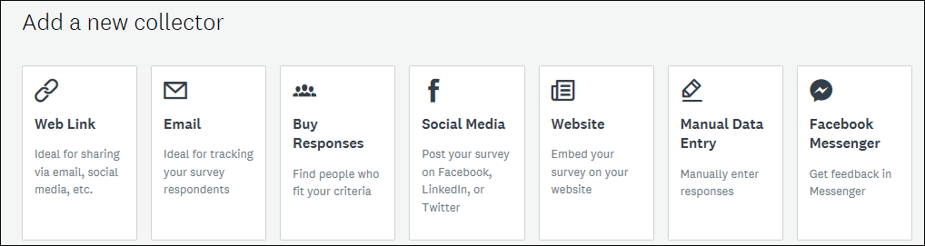
SurveyMonkey has many different ways to get responses.
Next to link and email, SurveyMonkey offers more options to get responses.
Google Forms allows you to add the survey questions directly into an email, which is very convenient.
In Google Forms, you can add the complete survey to the email body. That is very easy for the audience!
User Experience
Of course the user experience is very important. If your survey has a tiny typeface, or takes forever to load, people are not likely to complete it.
You can still check out and complete the surveys below, to have an idea of their look-and-feel. Remember: you do not have to add any real data.
This is the SharePoint Survey, in case you had forgotten what it looks like 🙂
The good old SharePoint survey.
And this is how you enter data into a SharePoint custom list: in the information pane on the right-hand side of the page, which feels a bit strange.
This is the regular input screen in any list for metadata etc.
Next to a rather large font size, SurveyMonkey has the option to create columns for answers, which I really like as they make good use of space:
Those columns are very good when you have many options to choose from.
I also like SurveyMonkey’s slider and the reordering options.
Google Forms has nothing special, but it looks solid and modern.
Responses
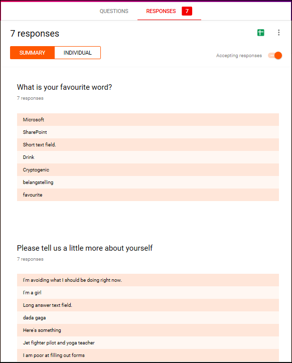
Thank you everyone who has responded to one of the surveys! This allows me to show some of the results graphs. This is what the various response pages look like:
Microsoft Forms:
Survey information on top, as well as an option to export everything to Excel. “More details” opens up all responses for a particular question.
Colourful graphical summary of the responses.
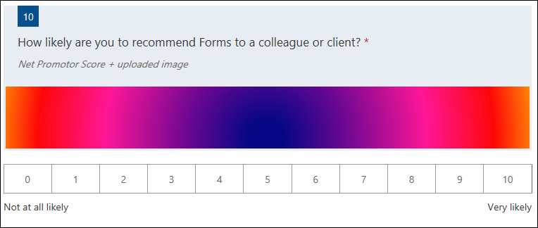
The last part of the survey. Aha, the Net Promotor Score IS quite a special thing!
SharePoint Survey. I am sharing only part of the graphical summary as I guess you have seen it before and it is not very exciting. Now I remember how annoying that “multiple responses” question is – you need to re-score everything manually! 😦
Graphical summary of the SharePoint survey. Limited options and that “multiple responses” summary is just not useful.
The SharePoint custom list has no graphical summary. You just see the responses as line items in a list.
SurveyMonkey has a very long page of results. All responses are shown with a scroll bar (see the first screenshot) or with a graphical summary first and then the individual responses below. For each chart, you can change the chart type.
I will only show a few screens.
You can see how many people answered and skipped the question. Most recent responses are shown on top; a scroll bar shows all responses.
A question where a pie chart would have been more appropriate in my opinion. But…clicking the “customize” button top right will open a pane to change the chart type.
The multiple-answer question. Looks good.
This is the question which allows you to move answers around.
Google Forms results look like this:
Top of the results page. The green button top right allows an export to spreadsheet.
Useful graph of the multiple-choice-question.
Bottom of the results. The “Net Promotor Score” is displayed as any other result.
Results
I have captured the results in the picture below. You can also view/download this as Excel. Look at the “Responses and Results” tab. Please use and edit it, but I would appreciate if you would mention my name if you share it outside of your organization.
Legend:
Green/Yes: Available by default, although it may have different names
Orange: Available with a workaround
Red/No: Not available
Comparison of the response and results options for the various tools.
Conclusion
Again, the classic SharePoint options are in a league of their own.
Microsoft Forms appears to have more in common with SurveyMonkey Free and Google Forms than with SharePoint. All three surveys are pleasant to complete and the graphical display of results is much better than with the SharePoint survey.
Overall conclusion
Forms is really the new way to conduct surveys in your organization and possibly with externals. It looks pleasant both on a SharePoint page and when completing it, it has a ton of good options, decent colourful graphs and it works with Flow.
Some people will really like that Net Promoter Score 🙂
I am sure that Forms will continue to develop, so I will try to keep this comparison up-to-date.
The SharePoint survey feels a tad outdated, although you can still conduct good surveys with it. The graphical summary is very inferior to what Forms has to offer. My suggestion would be to use this only when you need one of the more advanced Q & A options, such as selecting a name from someone in your organization. The whole permissions management is also more complicated than with Forms, as described in my “SharePoint Survey lifecycle” blog.
The SharePoint custom list may not be the option that comes to mind first when you talk about a survey, but especially the options to process the data after collection can be the reason to use it. You can group and filter the entries just like any View and edit entries (e.g. mark an item as “Completed” or add a certain category). With the additional column types and the connection with Flow this can be the tool of choice when collecting data from the organization is the starting point for a project or process.
There are no graphics by default, but PowerBI may be used if needed.
Many thanks to my former colleague Scott Lewis who pointed out the benefits of custom lists when combined with Forms and Flow.
SurveyMonkey is of course THE specialized tool for surveys. It has extensive help for your survey questions and many options. It is the only tool that can show columns of responses, which is nice to keep your survey compact. It allows you to change the chart type of the results if desired. However, the free version has a few annoying limitations and I personally find the “management” interface rather cluttered.
For large-scale complicated surveys where you need to analyze responses in-depth the paid version beats Microsoft Forms.
Google Forms is a solid modern tool. Apart from the “display form straight in an email” it does not have any remarkable features.
Hope this comparison is useful to you. Have I missed any that are important for you? Please let me know – also if it has helped to move your colleagues away from SurveyMonkey (free) or GoogleForms! 🙂
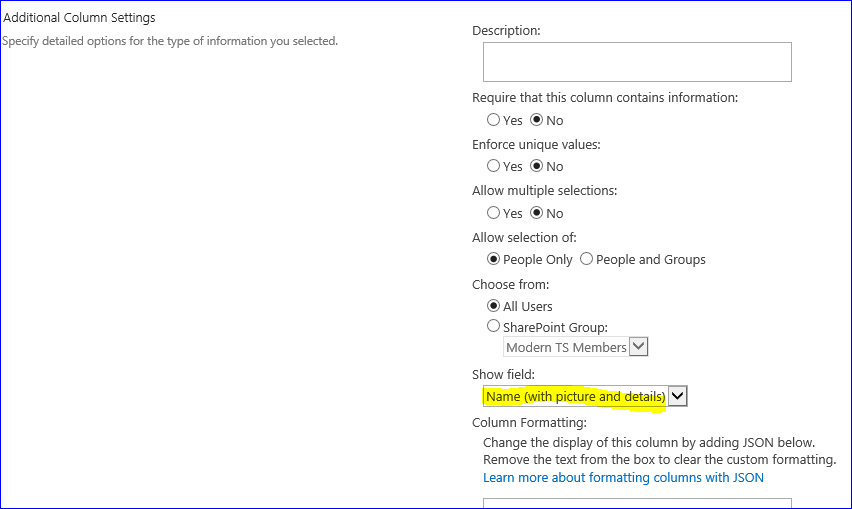
“It is possible to show the person’s picture in a list, next to the name?” the user asked me. “Of course”, I said, but it depends on the list and the definition of the column. Let’s have a look.”
The user did a screenshare with me and showed me the list. It contained a number of “People or Group” columns.
We checked the settings of the columns and it turned out he had used the default option, “Name (with presence)”.
The default option when you create a “Group or Person” column.
So I showed him there were more options and that he’d better select “Name (with picture and details)”.
I suggested this option to make the picture show in the list
So he did, and he went back to the list. But no image was shown.
No image next to the name 😦
The investigation
I checked the column again, as this was unexpected behaviour. Yes, that was the right setting.
I also tried the other options, “Picture only” in various formats. But the image would not show.
I was flabbergasted. Microsoft Office, especially in the Modern fashion, has such an obsession about pictures, images, icons and other visuals that I could not understand why the picture would not show up. I mean, I have to look at myself all day but SharePoint would refuse this?
But then I thought, what about Classic View?
The solution
I switched to Classic View and there it was:
This was what the user was looking for!
The user was happy and changed the Advanced Settings to make sure this list would always open in Classic View for all the site’s users.
I am not so happy, however. This was a modern site with a modern list and a perfectly legit column setting. Why is the picture not displayed in the Modern View, knowing the emphasis Microsoft places on visuals?
Please note it is the same with Styles and Totals – they only display in Classic View 😦
I have already added a warning to my SharePoint Style Counsel blog…
Additionally, over time I have grown an aversion to the Classic view as I think it looks cluttered.
So, does anyone know when can we expect these display options to be available in the Modern view?
About SharePoint Holmes:
Part of my role is solving user issues. Sometimes they are so common that I have a standard response, but sometimes I need to do some sleuthing to understand and solve it. As many of my readers are in a similar position, I thought I’d introduce SharePoint Holmes, SharePoint investigator, who will go through a few cases while working out loud.


 While List.ly is doing their best to get their Vimeo videos displayed properly, I thought I’d share a number of recent finds with you.
 In two earlier blogs I compared the
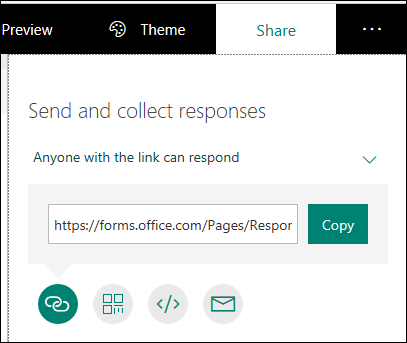


 The case