I am a big fan of using colour as an organization principle. So I always wonder what connects “things” from the same organization/sender/application suite/etc. with the same colour.
In August 2022 I wrote something about three apps with a dark red icon, wondering if they were connected somehow. At that time we already knew that Stream was being transformed, and I was thinking about the future of Delve. (See that post below)
Well, I was right! On December 14, 2023 we learned that Delve will be retired in December 2024, as the functionality is now well embedded into other applications across Microsoft365.
This is part of the message in the Admin Message Center:
Message Summary
We will be retiring Delve on December 16th, 2024. Most of the features and value offered by Delve today are already available and improved in other experiences in Microsoft 365. The main one being Profile Cards in Microsoft 365. Here is a list of features offered in Delve and the experiences we recommend using instead:
- Delve Home – discover relevant documents recommended on Office.com, in Office apps and in Profile Cards.
- Delve Profile – view profile data in the Profile Cards cross M365, through people in search on Office.com and search in SharePoint.
- Edit profile – a new edit profile experience tightly coupled with Profile Cards are being developed and will be released in second half of 2024. It is also possible for users to edit their profile data in the SharePoint profile edit experience (editprofile.aspx).
- Organizational view – exists in the Profile Card and as a dedicated experience in Org Explorer
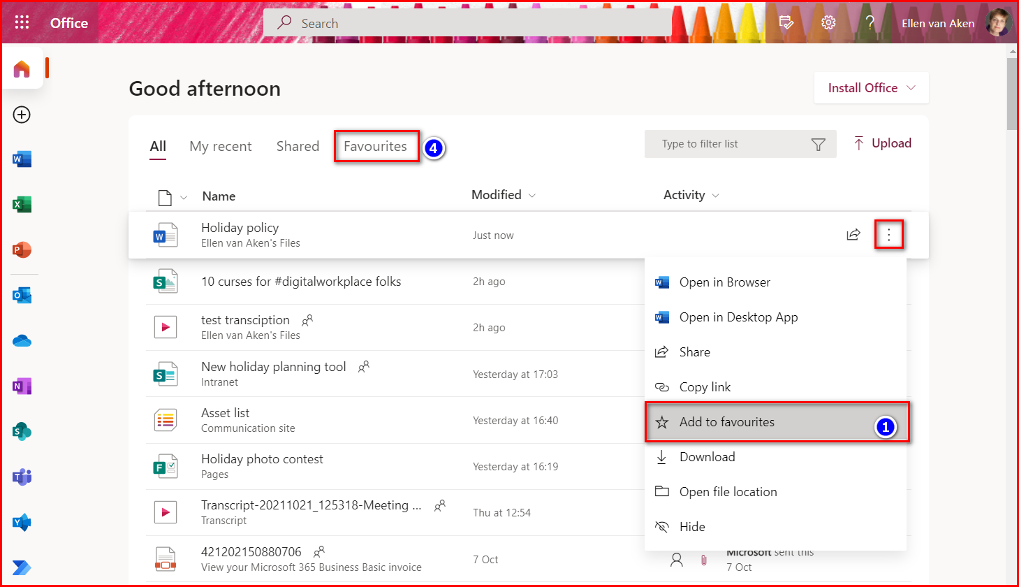
- Favorites – favorites on Office.com and OneDrive is not connected to Delve and is a good option for users with similar functionality and improved availability.
- Boards – will not be replaced.
I checked whether Outlook Boards could be a replacement for the Boards, but guess what? Those have been retired in June 2023 due to low usage. I guess the same was the case with Delve Boards.
Do I mind? Not particularly. As mentioned, the functionality has already been incorporated into other apps for some time, the Delve app is not visible to F3 users (although they can access it) and the app often causes confusion as generally, more documents are visible to you than you expect. Additionally, having one app less to think, teach or worry about in the Microsoft365 suite is probably welcome.
Now we just have to wait for information about Access 😉.


 While List.ly is doing their best to get their Vimeo videos displayed properly, I thought I’d share a number of recent finds with you.
 Delve is an interesting part of Office365.


