The new Microsoft365/Office365 Homepage

Over time I have captured the various appearances of the Office365/Microsoft365 Homepage. As you may know, I quite like this page as the page where I start work. 

That page is updated quite frequently, and I keep all versions in this post. Please scroll down and get some nostalgic feelings. 🙂

Update October 2022 👇

As announced during Microsoft Ignite 2022, Office365 will be renamed Microsoft365. We knew this for more than a year, but it was unclear how exactly and when this would happen. Now we know:
“In the coming months, Office.com, the Office mobile app, and the Office app for Windows will become the Microsoft 365 app, with a new icon, a new look, and even more features.” This will start from November 2022. Microsoft FAQ.

The announcement is on the homepage now. And compared to the December 2021 update, I now have recommended posts, and colourful ones as well, so the whole page looks much better than in December 2021!

All good and dandy, but you will probably have to update all your help materials and other stuff with texts and the new icon. 😒

Update December 2021 👇

Rather shortly after the last update, here’s a new one:

Microsoft365 landing page December 2021

The most obvious immediate change is that the “recommended” items on top of the page have gone. Although this was generally not extremely useful, it did provide some colour to the page, so the page is now rather bland. The icons for Lists are not displayed yet, so the page may get more colour when that has been fixed. Any upcoming meetings, and any actions you can do, will be displayed as “Recommended actions”, so that’s a plus. But if you do not have any of those, this part does not show.

Recommended actions, if you have any

The next thing I noticed is that the list of apps on the left hand side has been reduced. You can now no longer go to SharePoint from this page, but need to click on the waffle top left and then on the SharePoint icon. For someone who uses SharePoint quite often, this is not a plus.

I finally have Visio, but that is not a consequence of the redesign. 🙂

You can open some more apps, but not all. But hello, Visio!

That extra page, where your apps were displayed in alphabetical order, including some nice tips, is gone. You now get all apps in the left hand side, even when you click “All apps”.

I like the new way to create content. Click on “Create” in the sidebar and you can create all types of content. In addition to the items in the screenshot you can also create a Yammer post and a Whiteboard. You can also find templates here.

Creating new content

Clicking “My content in the side bar provides you with an overview similar to that on the landing page, but with additional filters on this page.

My content

The main part of the page shows a new design for all your content. The different filters are now buttons, rather than just text, making it more obvious that you can click on them, and when you do, the colour changes so you know very well where you are.

The filter bar

Clicking on “+” gives you more filter options, such as file type, location and persons. You can even add that semi-permanently to your landing page!

More filter options when you click +

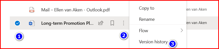
When you click the … next to a file name, it turns out that the menu is more condensed (which means more clicks in some cases). New options: add the file to ToDo or Calendar and convert it to PDF.
(I seem to remember that another PDF-creation option will be discontinued)

Gone is the option to download. The file location (very useful for my colleagues) has now moved to “Open”. The location of the file is no longer displayed underneath the file, but you can still see it when you click “All” on the bottom of the page, or when you go to “My Content”.

A more condensed file menu

My opinion: Mixed.
👍 I like the fact that you can easily create all types of content on one page, but all these options will confuse our users as they do not always know when to use what. I also like the filter options.

👎 I want to be able to go to SharePoint quickly! And my, does this page look boring right now!

Update February 2021 👇

A few quite subtle changes this time, mainly dealing with filtering and the tabs names and functionalities.

The page looks like this; you will notice that, besides the regular file types Lists are shown, as are Forms, videos in Stream and SharePoint News items. (See bottom). It also shows attachments from emails!

The changes in the new version are in the red-lined area: Tabs and filters.
You can see a number of file types that I would not consider “Documents”.

The first change is the option to filter, both on a word (top right above the list of files) and the file type (top left)

You can filter for file type to the left, and on a word on the right.

The second change is the name and contents of the tabs. The first tab is now called “All” and shows all kinds of items, the second one contains the “Recent” files you looked at or worked on, the next one is “Shared” (no change) and the “Discover” tab has gone and has been replaced by “Favourites” which used to be called “Pinned”.
On the one hand, I prefer the word Favourite but in many other places (Teams channels, chats) you can still “pin” things so I hope we will end up with one and the same word.
I personally will not grieve over losing the Discover tab, but this was the only Delve-mimicking functionality available for F3-licensed users.

The menu that you see when clicking the ellipses next to a file, will also show the word “Favourite” with the little star that we know from “Following a Site”. Hmm, this might get confusing. 🥴

You can now “Add to favourites” instead of pinning – it works the same. The star appears already when you hover over the file name.

All in all, a decent update. I like the word Favourites, I appreciate the filtering options and I am happy that that confusing Discover tab has gone.
I am less happy with Lists and all the other stuff on my “All” tab – it looks rather messy.
I hope we will get consistency in the use of “Favourites/Bookmarks/Pinned/Followed” and the symbols that go with it. 🥴

Update August 2020 👇

The new design has finally arrived at my personal tenant, but it is still a bit wobbly (on and off) in my work tenant. In case you think you need to communicate this: a 3-part explanatory popup is part of the rollout, so it should not be too much of a surprise to users.

  • All icons have moved to a left-hand side rail and are much smaller.
  • There’s a new Home icon (not sure what that does) and the + icon to create a new document looks a bit different too.
  • There’s also a new “All Apps icon”. This “floats” on the bottom of the rail, so it is always visible. Screenshots are below as the new WordPress Block Editor does not allow me to add images in a list block. 😦
  • The app names are no longer displayed, unless you hover over with your mouse, which is OK for me but may be rather daunting for new users.
  • As I have rather a lot of apps it means I need to scroll down to open some, especially when using my laptop screen.
  • Apparently the focus is on documents even more, but I do not see that as a major benefit. However, I have always liked the “Recent” and “Pinned” tabs, and so do my colleagues as they tend to lose track of their documents.
  • Still hoping for badges with the icons telling me if and how many unread messages I have in Outlook, Teams and Yammer – I prefer that over an endless slice-and-dice of documents. 
NewHomepageaug2020

The new Home icon:

Home and Create document icons

The new “All Apps” icon:

It’s the bottom one

Update July 2019 👇

The top part of the page has changed again, and now has more visibility of the + option to create a new document. I personally am not a fan of starting a document from the Office365 landing page. Navigating to the intended OneDrive or SharePoint location makes more sense to me, and is something I teach my users as they frequently complain of “losing documents”. The “Explore all your apps” link under the apps has been replaced by “All apps” next to the apps which makes sense.
And…the “Good day” message is back! Which I know is calculated and nothing personal, but I like it. 

Office365Home-July2019
Start a new document and the link to all apps are the changes for July 2019. 

The bottom part of the page has not changed.

Update February 2019 👇

The new icons have arrived! The “Good morning” message has disappeared, which is a pity, especially as the words “Apps” does not really add much to the party. And the Search bar is now in the top middle. I think this is the reason that the company logo has moved from this position to the left some months ago. It breaks up the nice colour gradient of my pencils though 😦

The bottom part has not changed. I am still looking for non-document updates, such as emails or notifications from Teams or Yammer.

Please scroll down for older versions of the Office365 landing page.

Office365Homepage23-02-2019
Top part of the Office365 Homepage as per 23-02-2019. New icons and the search bar is top middle.
Office365Homepage23-02-2019bottom
The bottom part has not really changed with the changes in Feb 2019.

Update February 2018 👇

Microsoft has recently made some changes to the Office365 Homepage. You know you will never have a dull moment when you subscribe!

The landing page now looks like the screenshots below. Compared to the last version, it has more white space and the icons are less bulky and coloured (I hope you have not created custom icons in white 🙂 )

It is more gentle on the eyes than the previous design, although that may also have been my own choice of theme.

The profile photo is also better integrated into the design, and my name is displayed.

O365Home-NewTop
The new Office365 Homepage top part as from end 2017.

It now shows more than just “recent” documents, and it shows folders in OneDrive and your Frequent and Followed sites, meaning you will be able to access your favourite sites from this page. This means it is becoming more relevant as the landing page.

O365Home-NewBottom
The new Office365 Homepage bottom part as from end 2017.

My desire to see more non-document updates is still there though. I would be perfectly happy to have this as the landing page to start my working day from, but then it needs different content as well.

In my original post below you will find screenshots of the two most recent versions, as well as what I would like to see next.

Original post from June 2016 👇

Yesterday I logged in to my Office365 and I immediately thought : “Wow, that looks nice”. It is not often that I am struck by a beautiful page, so I decided to write about it.

This is the top of the page:NewOffice365Homepage-NewMine

NewOffice365Homepage-Bottom
And this is the bottom of the page. You can decide to show more documents.

First good impressions:

  1. The small top bar is much larger now and that really looks good. It must be my Raspberry theme, although it also looks cool with Cats 🙂
  2. The welcome message is nice, although I know it is calculated from my time zone and my account. Still, it looks vibrant and cheerful.
  3. Your most recent documents are displayed underneath.
  4. You immediately see you can install software. On iPad, you can download Office apps.
NewOffice365HP-iPad
This is the new Office365 Homepage on iPad

What would I like to see as improvements?

  1. It would be nice if you could also search for other things than documents. I am trying to wean myself (and my colleagues) of documents where possible, and this does not help.
  2. That also goes for the recent documents underneath the apps. I would like to see my unread email, or my unread Yammer messages, or the Tasks due today, as well as documents. If Office365 is going to be my Digital Workplace, it should display more than just documents.
  3. A little badge on each app to show the number of unread messages, or new tasks, or something like that,  would also be nice!
  4. The coloured bar overlaps the profile picture a little, so that needs some tweaking.

And this is the page as it used to look (on a different tenant) or still looks, if you are not on First Release.

NewOffice365page-old
The “old” Homepage

All in all, I quite like this change and I think it can be made even better!

9 steps to clean up your OneDrive

CleanOndrive-headerAs mentioned in earlier posts, the majority of my colleagues have 2 GB of storage space in their OneDrive and some struggle to stay within those limits.

So, we are currently helping them with cleaning up and giving them some tips on how to keep within boundaries. It may be interesting for you as well!

1. Empty the Recycle Bin

You may want to start with a clean slate, so let’s empty the Recycle Bin first. If, during cleaning, you accidentally delete too much, you will have fewer documents to search through for restoring. Also, emptying the recycle bin will free up space!

CleanOnDrive-recyclebin
Click “Recycle bin” on the left-hand side and then “Empty recycle bin”

2. Check the size of your OneDrive

It helps to know how much stuff you have, and how much you need to remove. So, click on the Gear wheel top right, click “OneDrive settings” and then select “More settings”. You will pass a useful screen with notification options – worth looking at but out of scope for this post.
Then click “Storage metrics”.

CleanOnDrive-size
Almost there!

On the next page you will see the lists in your OneDrive site collection (it is a SharePoint site collection, after all) and the amount of free space is shown top right.

Cleanondrive-storagesize
Look at the top right of the page to see how much free space is left.

3. Move shared documents to SharePoint or Teams

Sharing documents in OneDrive to collaborate on is great as long as the document is not final. Once it is final, please move it to a SharePoint site so it can be part of the team’s collective knowledge and make room in your OneDrive.
Do not hoard shared OneDrive documents – if you leave the organization your OneDrive will disappear with all its content. (After a period when your manager can access it.) We frequently get questions about lost shared documents as many people appear not to be aware of this. 😦

Do you plan on leaving the organization soon? Check out this post to see what to do – and start now.

So, check out which documents you share and with whom. Do you still need them at all? Do you still need to share them or are they ready to live elsewhere?

cleanOnDrive-shared
The overview of the documents I share with others – “Departmental docs” sounds like an excellent candidate to be reviewed and moved!

If you want to move the documents to SharePoint, go back to your “My One Drive” section, select them and then click “Move To” from the grey bar and select the SharePoint site where they will live. (Make sure you follow that site so it appears as one of your first choices). The documents will be deleted from your OneDrive in the process. (If you want to know how Copy To and Move To work, read my earlier post and also my post about the risks)

CleanOnDrive-moveto
Moving documents to a SharePoint site

If you have many documents to move, you may either want to do it in smaller batches or use Copy To and delete the documents after you have checked that they have all safely arrived at their SharePoint destination.

And if you no longer need the documents you share, you can just delete them.

4. Create or Request a SharePoint or Teams site

In case you have no location at your disposal, create or request a SharePoint site or a Team (which comes with a SharePoint site) so you can share documents with your project team or department.

5. Find the largest and the oldest documents

Unfortunately you will have to do this by folder, as you can not create views without folders. Although OneDrive is a SharePoint site, it misses some cool SharePoint functionality, such as the option to add metadata columns and create views, or the possibility to add templates. (note to self: submit to User Voice 🙂 )

The following paragraph has been added in May 2020:
* Please be aware that Microsoft365 adds folders to your OneDrive when you use certain applications. The “Attachments” folder to store email attachments is one, but Apps (contains Forms documents), Microsoft Teams Data, Microsoft Teams Chat files and Pictures can also contain a lot of documents that you may not be aware of.  Read my post on this topic*

Open a folder and click on the pull-down arrow next to the File size column and click on “Larger to smaller”.  Determine whether the largest files need to stay on your OneDrive. They may fit on your SharePoint or Teams site as well, so you can Move them there, or perhaps they can be deleted.

cleanondrive-sortlargest

Then sort for the oldest documents by clicking the pull-down arrow next to the Modified column and selecting “Older to newer”. Generally you will have accumulated quite a lot of documents in your career. When projects have been completed or interest has waned, you might as well move them to a SharePoint archive site, a records center (in that case they should have been moved there long ago!) or delete them.

6. Remove versions

This can make sense for very large documents that you have worked on intensively and that you want to keep. There may be several versions that take up space.
Select the document, click the … to the right of the name, and select “Version History” from the menu.

CleanOnDrive-remove version1
How to go to the version history

You will now see the versions.
If you are still working on the document, it may be safer to remove the oldest versions only.

CleanOnDrive-rremoveversion2
Click the version you want to remove and select “Delete Version”. Repeat if needed.

If your document is final, you can delete all versions and keep the latest version only. If there are many versions involved, the quickest route is to go to the Storage Metrics (see par. 2), click on “Documents” and drill down until you see the document.

Ondrive-versions3
This is a good way to remove all versions in one go.


Click “Version history” on the right of the document and then you will see an option to delete all versions in one go, leaving the last one.

ondrive-version4
This is the best way to delete all versions in one go.

7. Move private files to a personal location

While it is all too common to have a mix of private and organizational docs on your systems, your OneDrive is primarily meant for organizational stuff. Your private info should not be here, especially if it takes up valuable storage space.  You also do not want to lose it when you leave the organization, right? So, move your personal files and photo’s to your private OneDrive (now with extra-secure Personal Vault), iCloud, Google Drive, a USB stick or another place.

8. Empty the Recycle Bin and check storage

Hopefully this has helped you get below that 2 GB. If you, you need to repeat and be a little more strict this time around!

9. Repeat regularly

In order to stay below the limit, go through these steps again on a regular basis.

10. Bonus tip: Give your folders different colours

(Added December 2023)

If you have many folders and would like to see in one glance what is what, you can now give your folders different colours. How cool is that?

Greg Zelfond explains how to do it and what to look out for: https://sharepointmaven.com/how-to-color-code-folders-in-sharepoint-and-onedrive/

Do you have tips?

Do you have experience with colleagues whose OneDrive fills up quickly? Any suggestions that we can use?

Playing “the shell game” with SharePoint folders

ShellGameThe other day, I gave a training session in SharePoint document management. For most people, managing documents in SharePoint is synonymous with  “putting them into folders”  so I knew I had some explaining to do.

I decided to demo “folders”  and  “metadata” with a simple example.
I created two document libraries.

  1. Folders: Amsterdam, Barcelona, Paris.
  2. A choice column called “Location” with the same cities, and one column for Document Categories “Agenda”, “Meeting Minutes” and “Presentation”. Of course I prefer to capture Meetings information in a different way, but this example would be familiar to most people.

Both document libraries contained 5 documents, according to Site Contents. 2doclibs I showed both libraries and asked my audience to tell me how many documents there were for location Amsterdam.
For the metadata library it was easy: it was specified in the Grouping.

Grouping shows you immediately how many documents are in a certain category.

The other one was a bit less obvious. So I said I’d give away my precious SharePoint mug to the first person that could give me the correct answer.

Silence.

So I opened Paris. 1 document.

Then I opened Barcelona. 1 document.

“Three” some people shouted. I opened the Amsterdam folder. No documents in folder Amsterdam. Nothing.

The audience gasped, and looked at me expectantly. Then I told them that a folder is counted as a document. And I showed them the other library again with the much more transparent grouping, and also showed them a view grouped by Document Type, and some other views.

The next day, two people called me to ask if they could do “that with the groups” in their own site.

I may still have several thousand people to convince but I was happy to see that some people got it. So, perhaps this is a good way to show people the difference and the benefits.

Please let me know if you have the same experience – or have found other ways to convince people in a nice way that they can relate to. Summing up all the reasons for not using folders is not always convincing for end users.

It is a sort of “shell game” really. O dear, have I just done gamification with SharePoint? 🙂

And in case you were wondering:  this is my SharePoint mug!

SharePoiint mug
My wonderful coffee mug from a SharePoint Connections event. Translation: “Silence! SharePoint guru tanking inspiration”.

7 Tips for copying from Excel into a Datasheet View

ExcelDatasheet-LogoSome time ago I was working with an Excel-loving crowd who had to share their data in a SharePoint list.
I wanted to make the transition as smoothly as possible, so I created a special “Data Import View” (a Datasheet View) to make it as easy as possible to copy their Excel data into the list.

There were too many people involved with too many different PC configurations, to trust a Data Connection. So a one-time copy-paste action it had to be!

After some tests I gave them the following instructions:

1. Sort the columns in your Excel sheet in exactly the same order (left-to-right) as the Data Import View (I listed all columns in the correct order)

2. Use the exact same words, spelling and capitalization as the values in the dropdown fields in the SharePoint list.
I listed all the words – we used “color”  and not “colour”, for instance.
If you use different capitalization in a Choice column (e.g. “Preferred Supplier” instead of “Preferred supplier”) the Choice column will accept your value without error message, but when you edit the item, the value will change to the first of the Choice values.

3. Check your cells have exactly the same formatting as the SharePoint list.
Sometimes text fields gave errors while copying – copying the text from the dropdown field and paste that into the Excel file often solved that.

4. Use the correct date-and-time format. (I had to test a few different notations to know what worked and what not in our multinational organization)

5. Select the first (utter left) cell before you start pasting. (The Data Import View contained many columns, and needed horizontal scrolling to see all columns, and sometimes people forgot to scroll back).

Error message
This is the error message if you do not start on the correct cell

6. Start pasting only when the first cell is ready. It shows a bold line around it.

Bold line around cell
This is what the bold line looks like

If your fist cell looks like this, please click it, otherwise you get the below error message when you paste.
If your first cell looks like this, please click it, otherwise you get the below error message when you paste.

Error message if you paste into a cell without a bold line around it

7. Do a test-run with one line. Adjust your data and check again when you encounter issues.

Next time your users say that “they can not copy -paste their Excel data into a Datasheet View”, these tips may point you towards a solution.

I could have made things slightly easier by using a single-line-of-text for each column. Single-line-of-text is like bloodtype AB:  it can receive anything :-). But because I had originally designed the list for adding new items via “New Item” in the Standard View we had to create these instructions. And single-line-of-text columns lead to more deviations in spelling.

David Young has also found that you need to refresh your screen after deleting data and trying again.

Do you have any other tips or experienced other errors? Please share!

You may also like:

Dangers of the Datasheet

Design Fault, Scope Creep, Moving Insight or Unexpected Success? (The project that inspired this post)

10 tips for Choice or Lookup Columns

No more meeting minutes!

NoMeetingMinutesWhen I visit “collaborative” sites, e.g. for a team, a department or a project, I often find a document library called “Meetings”, or even worse, several document libraries, each for one particular meeting date. These generally contain documents for prereading, presentations from the meeting, agenda and minutes. And sometimes they have an action or decision list as well.
The good thing is that these meeting documens are now in one clear online location, and that (hopefully) sending documents via email and printing are reduced.

But now think again. It is 2013.

  • Do you still store everything in document format, while there are ways to do thing directly online?
  • Do you have to open multiple Meeting Minutes or Decision List documents when you are looking for that one decision from early 2012, but forgot the exact date?
  • Is there still someone responsible for writing down “refer to next meeting” for several agenda items in the Meeting Minutes, and then remembering to add them to the next meeting agenda?
  • Are you still emailing various draft agenda’s to your team?
  • Does someone in your team have to collect the progress of the action list and recreate the new Action list?
  • Do you have to chase everyone for approval of the meeting minutes?

A different approach.

It may be time to move to a simpler process. Of course there is the Meeting Workspace, but sometimes you prefer to have everything in one site. The MW will also no longer be supported in SP2013.  An alternative is the Meeting-Agenda-and-Minutes List, combining agenda, meeting minutes and decisions in one list. Our team started this in about 2002 and we have happily used it for our weekly team meeting for years.

The concept is as follows:

  1. Everything you discuss is first an agenda item. The owner of the item creates and manages it themselves.
  2. All items not marked as “completed” are visible.
  3. The meeting owner adjusts the order of the agenda items just before the meeting.
  4. During the meeting, the item is discussed. We always had online meetings, so we viewed items on-screen. The item owner can adjust the item while discussing, and show the updates to the team.
  5. After discussing the item, the decision and date are added to the item and the status is set to “completed”.
  6. All completed discussions are stored in one or more “completed” views, sorted and grouped as needed.

Example.

Does it sound complicated? Let me show you the (Custom) list that I have worked with.

This is an item on the agenda:

New Agenda Item
This is the item to discuss.By default, status is “New”.

This is the agenda, sorted on “Order” and filtered by “Status is not equal to completed”.

Agenda
This is the agenda for the upcoming meeting.

During the discussion, the relevant info and decision are captured in the bottom fields of the item.

During Discussion
During discussion, the relevant information can be added.

This is the view that shows all items that have been discussed. You can easily filter for specific topics, regardless of meeting date. Of course you can also group on other metadata, but this view clearly shows the increased transparancy compared to Meeting Minutes in document format.

Completed
All decisions from earlier meetings, grouped by discussion date.

Of course you can simplify or extend the list to fit your own meeting style and goals.

What are the advantages?

  • No need to send agendas via email; if everyone sets a notification you wil get a message when a new item has been added or changed.
  • The meeting owner can easily adjust the order of items
  • During the meeting, the item is open and any next steps can be added straight away
  • When something is not discussed or no decision has taken place, it simply stays on the list. You do not have to specifically state that it is “moved to the next meeting”.
  • One archive of individual decisions means you do not have to look through documents by date. Now that you have one “online database” it is much easier to find any decisions relating to your topic, since they can be found by date AND by creator AND by tag if you have used those.
  • Everyone has seen the decision so there is no need to circulate any meeting minutes for approval.

Will this work for all meetings?

Of course this needs change management. If your organization is relying heavily on documents, not used to PC’s and projectors in the meeting room, or has been pampered by people sending things to them, this will be a big change that will need discussion, training and an extensive trial period.
It may be wise to measure time involved in the current meeting setup beforehand and to compare that to the new setup. This information will also help you to convince others.

For some meeting types this setup may not be appropriate. There may be legal requirements to have documents, perhaps even printed, with handwritten signatures, or some external participants may not have access to your SharePoint environment.

But for your average team, department or project group meeting, this may save lots of time!

Have you used something similar? Please share!

Note April 2013:  Gene Vangampelaere shares his use of OneNote for meetings. Nice!

Travel arrangements in a Team Site

In my previous post I realized that I did not have an example of data collection via Excel files, so here is one.Business woman travelling
Are you on the receiving end of Excel files that you have to complete and return? Isn’t that annoying?

  • You have to open the file, enter the data, save the document on your PC, open email, pick file from your PC and then return it to the sender.
  • The sender has to spend lots of time on aggregating the different Excel files into one. He or she has to deal with changes.
  • Then you have to wait until the sender shares all information with you, as well as versions 2 and 3 etc. – if he or she ever does.

What was the situation?

Our HR team organized a global business development training several times a year, for a number of employees from all over the world. It was done in a central location. The training manager wanted to share preparation materials, as well as documentation and an evaluation for after the training, in a Team Site.

What is the solution?

The first step was to create a Team Site for the curriculum (calendar), the pre-reading material (document library) and pictures and bios of the attendees (picture library).  After the training, the documentation would be added in another document library.
The training manager started saying “For our evaluation I always use SurveyMo…” but she stopped quickly when she saw the expression on my face :-).
I added a SharePoint survey to the site.

Then she told me she was going to send out the customary Excel file to collect travel and diet details. She was not looking forward to that, because it meant a lot of cutting and pasting information. Then there were always changes to the schedules after she had completed and shared the consolidated file. Surely she could spend her time on better things!
So, in the Training Team Site we created a custom list with the relevant fields.

Now, with the introduction of the site to the participants she also sent a link to the Travel Arrangements list, where everyone could add  (and edit) their own information. We added a “count” on various diet preferences, so she knew how many of which diets were needed. We showed people how to filter the data to find attendees from the same country or with a similar schedule, allowing sharing a taxi or meeting up before or after the event.
I showed the manager how to set an Alert and how to export the information to Excel.

Travel - Data Entry screen
The complete Travel Data Entry screen. (Please click to enlarge)

Travel-All Items
All entries, allowing people to see eachother’s travel schedule. Clicking on a person’s name shows all details, such as flight number etc.

Entries grouped by diet
Entries by dietary requirements. This was a useful view for catering.

After the training we created a template from the site to use for other instances of this training.

What are the benefits?

  • Sharing all documentation via a Team Site saves email traffic – there are no large attachments and everybody knows where the documentation is
  • The participants can manage their own travel schedule and can always see everyone else’s, allowing all kinds of interaction
  • The training manager saves time with the travel arrangements because all information is added to the list and she only has to export the information if she needs it as a document
  • Since we turned the site into a site template her next trainings will save her even more time because the configuration is done and the standard information is already in the template
  • The participants are being exposed to a variety of SharePoint functionality

Using a SharePoint list for the travel arrangements is only a small process change, but it is another example of how you can save time and effort with SharePoint.

Image courtesy of stockimages at FreeDigitalPhotos.net

4 Common processes that SharePoint can streamline

commsSo your organization has a SharePoint intranet. Your Communications team has done their best by creating and executing a communication plan including a teaser video, a naming contest (Check out this collection for inspiration), emails, intranet news articles and posters. They have given you a training and perhaps a nice gadget like a pen, a  mug or a USB stick. The intranet is here and it will be used for news, blogs, video, employee services, policies and procedures. Oh yes, and you can have Team Sites for collaboration. Good luck with it, folks!

But how often does an employee change their personal details online? How often do they go and find a policy? How many video’s will they upload? If they do these things only occasionally, they will never learn how SharePoint can help them in their daily work.

Few people know that SharePoint is very good at streamlining those annoying little processes that have been wasting your time for ages. Here is a list of processes that can be found in every organization, where SharePoint can add value by saving time and effort.

1. Recurring projects

Many projects occur regularly and follow the same procedures. Think about innovations, promotion campaigns, year plans and recalls.
You can create a tailor-made subsite and make a template out of it. If you use this in one site collection you will be able to create a ready-to-use team site for every project in almost no time, have all projects in one place and support consistency in your process.

Example: Crisis Management 

2. Requests with incomplete data coming from multiple channels

How often do people send you a request, by plain email, telephone, or Word/Excel document? And how often do you have to contact them again to ask for missing information?
Depending on the complexity, you can use a simple SharePoint list, an Office template in a Document Library, or an InfoPath form in a Forms Library, with mandatory fields. As additional advantage SharePoint stores all your requests in one central place, so you do not have to spend time on filing them. You can even add a filter to show only those requests you still have to process. The finished requests can be used to gain insights in your process.

Examples: Employee Directory  and Packaging Requests

3. Editing an online Excel file by many people at the same time

When several people are updating one Excel sheet in a document library, especially when this has to be done in a short period, e.g. at the end of the reporting period, you are asking for problems.

  • If you use mandatory check-out, editors may forget to check-in and you will have to chase people to check-in or to override the check-out yourself.
  • If you do not use mandatory check-out before editing, chances are that people edit the file simultaneously and overwrite each other’s changes.

Why not use a list, where everyone can update their own line items independently from others? Not only will it save problems, but you will also have much more transparency and better overviews if you do not “hide’ your data in a document.

Example: Telesales

checked-out document
Checked-Out Document

4. Collecting data by sending (Excel) files to a large audience

This is still a favourite process in many organizations. As the process owner who asks people to complete a form by the end of the month, you will have many files to chase and store. Then you have to spend your valuable time cutting and pasting the information into a report before the due date.
If you use a list to collect the information, you will have less inbox overload (just a small alert email when someone adds their information will do) and much more time to spend on analyzing your data and setting a strategy. That is what they hired you for, after all! And the results will be more transparent to your audience.
In fact, you may not even need that report at all…

Example: Travel arrangements in a Team Site

Do you recognize these situations? Could you please share some examples of how you have handled these processes with SharePoint? All tangible examples help us to help our colleagues save time and effort.

“Lady with megaphone” image courtesy of Stockimages at FreeDigitalPhotos.net

Design Fault, Scope Creep, Moving Insight or Unexpected Success?

The design.
Once upon a time, I created a Team Site to facilitate a global project. It was based on a custom list where global and local people could enter project data, such as business unit, product, and a code from a choice column. The code represented a number. I suggested to the project owner that we add a column with the number corresponding with each code, to enable an automated calculation of the value of the item. *1)
The process owner did not think that was necessary. He wanted to keep things simple and would do the aggregated calculations via an Export to Excel.

Testing and feedback.
When the lists and specific views had been created, I asked the process owner to test and discuss this with a selected number of the 50 designated users. He came back with some good feedback and change requests. We ended up with 4 custom lists, each with the same structure, but with different values to select from.

So far, so good. We launched the site.

At first…
Shortly after introduction the site started to fill with entries. The only negative comment was when one person was flooded with Alert emails when someone  bulk-uploaded 500 entries. I showed him how to change the default “immediate” Alert into a “daily summary” and we happily agreed this was a sign of success.

Success
Success!

But then…
After some weeks, I noticed that Excel files with the required information were being uploaded to the site and updated online. It turned out that many business units had been doing this same exercise already on the business unit level, and thought they would share and update their work (which had been done in Excel) in our site. I would have preferred them to add their data directly into the lists, but it was a good sign that the business units wanted to share.

You can imagine what followed: “How can we upload the content in those Excel files into the lists?” It was not too difficult to create an extra Datasheet View with all mandatory columns, export it into a Template, and write a short manual on how to copy the content from Excel into the lists. *2)

And then…
Meanwhile, requests for access kept coming in from across the world. There were now about 200 people who wanted to share their data instead of 50. Great!
The site also got senior management’s attention. They wanted to show the real-time project results on the site’s Homepage so everyone would be stimulated to add to the numbers. Yes, I could understand that wish, but it meant that I had to add that extra numerical column in each of the lists after all (that the process owner had decided to leave out in the design phase) as well as a calculated field, and change all the views and templates. That was not too bad, but someone had to update all existing 1500 entries with the corresponding number.
A volunteer was appointed to do just that. 🙂

But wait…there’s more!
Just when I thought the whole setup was stable, the process owner approached me and asked me if we could capture two other values in the list while we were collecting data.
For me this was 30 minutes work, but for him it would mean that he had to communicate a change, re-educate everyone, and revise the input template and the manual. And for all business people it meant they would have to find out those values, revisit their entries (by now we had about 4000 entries) and update them. The “volunteer” could not do it this time, because the values were not as straightforward as the code.
He decided not to do it.

What do we call this?
It all worked out well in the end, but I have wondered what this is.

  • Is it Design Failure because we did not envisage properly how the site and project would develop? Should I have been more insistent on adding that numerical column from the start since I knew that would come up? Still, I could never have foreseen the wish to collect those two extra values.
  • Is it Scope Creep because the process owner had not set enough boundaries for what he wanted to achieve?
  • Is it Moving Insight because the organization learned what you can do with SharePoint as they went along and it was only natural that they wanted to make the most of it?
  • Is this an Unexpected Success because it worked well and we should be happy that it sparked so many new ideas?
  • Or is this just The Way These Projects Go?

This is something that I have experienced more often and I never know whether I should be happy about it (because it shows people learn about the possibilities of SharePoint) or sad (because it shows what we are not so good at project definition).

This is the reply when I asked the question on Twitter:

designfault

What is your experience and how have you dealt with this?

*1) The drop-down had too many items to enable an IF, THEN formula to calculate the number. Next to that, there was a “specify your own value” field if the project had a non-standard code.
*2) I thought connecting the Excel to the list would be too tricky for most users, and I also did not know how SharePoint or our system would react to so many simultaneous connections

Image courtesy of Ambro / FreeDigitalPhotos.net

Telesales in a Team Site

TelesalesOne of the teams spends their days making telephone calls to customers, asking them about a brochure or telling them about a new product or a special offer. This team has many calls to make each day, the more the better!

All phone numbers were in an Excel file, which was shared in a Team Site. Every Call Agent looked through the Excel file for the numbers assigned to them, and after the call edited the line item with the outcome of the call, as well as changes in information that they had learned during the call. (E.g. new contact person, change in telephone number).

What was the problem?

  • Opening the file and finding their assigned phone numbers took a long time.
  • Editing the item and saving the information caused waiting time (if the file was checked out by another call agent) or overwriting issues, (if a call agent forgot to check out)
  • All customers were in the file, whether they had been called or not
  • Management was always asking “how things were going” because they were curious and nobody had an overview of progress or results. This meant Call Agents had to spend time on ad-hoc reporting, which took time away from their calling time

What is the solution?

We opened up the Excel file by importing the data into a pre-configured Issue list in a Team Site. We created different views, such as:

  • New calls to be made, as well as call-back appointments, grouped by Call Agent
  • Completed calls, grouped by Result Code for a quick overview with sums (e.g. Appointment, Not interested, Business Discontinued, Offer)
  • Export view to export the data back into an Excel file for detailed analysis

By removing the finished calls to a different view, every call agent can see quickly which and how many calls he or she needs to make, without making mistakes.
We also added some real-time Excel graphs for management, so they can see progress and outcome of any promotional action in real-time. These graphs can also be used to evaluate the Call Agents’ performance and to share tips for a succesful approach between Call Agents.

What are the benefits?

  • Call Agents know exactly which customers to call or follow-up; editing a line item is much faster than editing a file so they can do their work more quickly
  • Call Agents make less mistakes in calling a customer twice or overwriting someone else’s edits
  • Management has a real-time overview of progress and outcomes, and they can see that without bothering the Call Agents
  • It is now possible to see progress as you go along, enabling the Marketing Manager to make adjustments during the promotion
  • It is clear which Call Agent is most succesful, which enables exchange of good practices between Call Agents

All in all, this simple Issue list has enabled the Call agents to make TWICE as many calls a day as before!

So, small wonder that other departments have embraced this solution as well – by now there are 3 teams calling in this way.

Another succesful cure for  Document Addiction! 😉

Please find a screenshot below, this shows the real-time Result Codes (e.g. Call, Written Proposal Requested, Meeting Requested, Already Bought This; Not Interested etc.) on the horziontal axis. Vertical is the count of this result code. The graph is slightly distorted because screenshot was made early in the Action, when there were still many calls (3344) to be made.

Telesales results by code

Below is a screenshot of the results by Call Agent. On the horizontal axis the names of the individual Call Agents, on the vertical axis their stack of different result codes. This enables management to monitor both their productivity (# calls made)  and their effectiveness (# of calls that have a favourable result). Please note that Call Agents do not all work fulltime.

Results by Call Agent


Image courtesy of Ambro at FreeDigitalPhotos.net

Facebook in a Team Site

“We need something like Facebook’s the Wall”, one of our Field Sales Managers told me. It was interesting to see that a popular external tool was triggering people to think about a similar solution in the company. They could not use Facebook because their information is confidential, but by describing it in that way, it visualized their needs very clearly.

What was the problem?

It turned out that 16 Sales Managers, all working outside the office, had a habit of sending a daily report of their store visits, including pictures, to all 15 colleagues + Manager + 10 back-office employees, by email.
You can guess the situation: everyone stored lots of emails, with the information hidden in documents, not tagged or categorized, and their email boxes were all too large because of all the pictures. So, what they needed was one central place where they could upload their Sales Memo’s and pictures, and where the back-office could find all reports per customer, or on a certain category.

What is the solution?

Well, we did not have Facebook, but we could do that in a Team Site. I used an Announcement list for the Sales Memo’s, adding mandatory customer and category dropdown fields, and a Picture Library was added for the pictures (also with customer dropdown).

SalesMemo

I added a search function and told everyone how to set a Daily Summary Alert, to enable everyone to know if something had happened.
The last 5 Sales Memo’s were shown on the Homepage, with the name of the creator, which triggered all Sales Managers into adding all their Sales Memo’s immediately. This  little vanity trick helped speed up adoption!

SalesMemoHomepage

What are the benefits?

  • Less emails sent & stored
  • A central transparant database is created
  • Information is easily searchable due to the customer and category metadata
  • Less time and irritation while searching

And when it was properly implemented, the Field Sales Manager asked me another question…but that will be another Blog item. 😉

Do you have an example where a popular tool shows people the way to working more efficiently? Please share it!