
When you open my clothes cupboard you will see , from left to right: red, orange pink, purple, blue, white, grey and black. That is right: I organize my top garments (blouses, sweaters, jackets etc.) according to their colour.
Colour sends a very strong message, it is almost the first thing you notice when you look at something. Colour can also be used to highlight differences and similarities between entities.
So, I am very happy that it is now possible to change the colour of a folder in OneDrive or SharePoint. I think this can help with finding the content you are looking for.
Gregory Zelfond shares a pretty complete how-to and a number of facts about coloured folders:
How to Color Code Folders in SharePoint and OneDrive | SharePoint Maven
Colour can give a very fast indication of the contents of a folder, but no more than that. It should not be your only organizing principle:
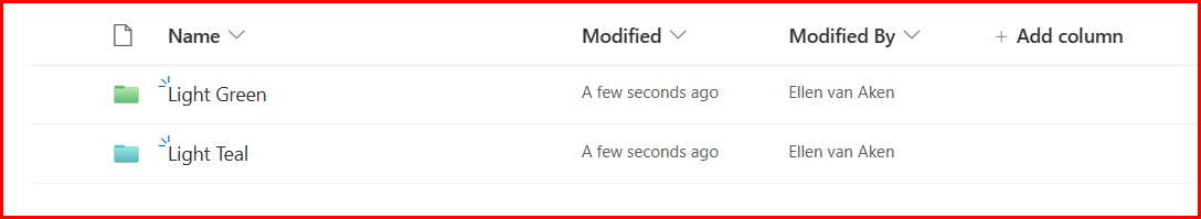
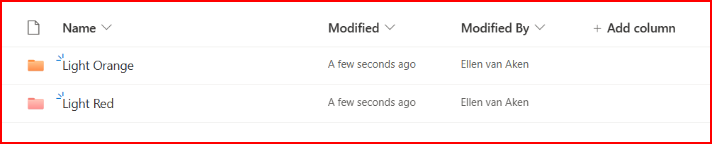
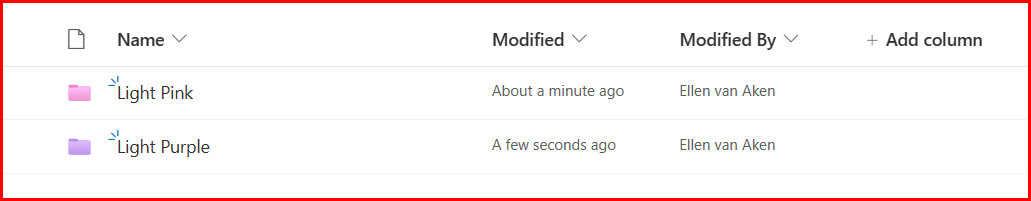
- Some of your colleagues may have eyesight issues, so if they use a screenreader they may hear the name of the folder, but not the colour; they may be colour-blind (especially common for red/green colours), or they may suffer from cataracts, which may make it hard for them to distinguish colour nuances. Light red and light orange have little contrast between them, as have light green and light teal, and perhaps light purple and light pink.
- Light can influence contrast, both the light in the room as the brightness of the screen.
- A colour may mean different things to different people, for instance a favourite (or hated) football club. ⚽🏉
- The colour sequence green-yellow-orange-red may confuse colleagues if used in a different context than meaning something like good, not so good, bad (or variations on that theme).
- Colour is not specific enough to be a stand-alone attribute. You will still need a good folder name, and possibly a number and an emoji. (I wrote about the use of emoji earlier)
So, how can you use the colours to your best advantage? It depends….on the owner but mostly on the audience.
OneDrive
OneDrive is your own set of folders, so you can do whatever you like. You can create a rainbow, make all folders pink, use the favourite colour of the person you share a folder with, or apply the colour according to the app where the folder comes from. (Remember that Microsoft365 creates folders in your OneDrive when you use certain apps?)
This is the latter:
So, whatever works for you.
SharePoint team sites
For SharePoint it is slightly different.
Firstly, your OneDrive is one document library, and you will see your folders immediately. In SharePoint you will need to open a document library first to see the folders.
Secondly, team sites are for collaboration, so colours may not be your decision alone. You will generally know the people working in this site, and probably meet on a regular basis, so you need to discuss what colours and labels and sorting principles to use for different folders, so that everyone understands what the folders are about. If there is a lot of employee turnover, you could add instructions about the use of colour.
SharePoint sites from Teams
In general, this works like SharePoint collaboration sites with a few gotchas, e.g. you can not change the colour of the General folder, and in some views the colours will not be shown. Please see Greg’s post!
As with the stand-alone SharePoint site, you will want to discuss with your Team members which labels and colours you would like to use.
SharePoint communication sites
As these have a large and generally unknown audience, this is more of an “information sending” site. It will be more difficult to use meaningful colours, as they may not be obvious to your diverse and dispersed employees. Some explanation may be needed.
On the other hand, I do not think many employees will go into your folder structure. I expect they will mostly access documents through Search and links in News items and on pages.
Still, there are few things you can do to make things easier:
You could use one colour per document library, so people know in which library they are, e.g. the Finance, HR or Communications library.
If you have one library for all departments, you can use one colour per folder for each department.
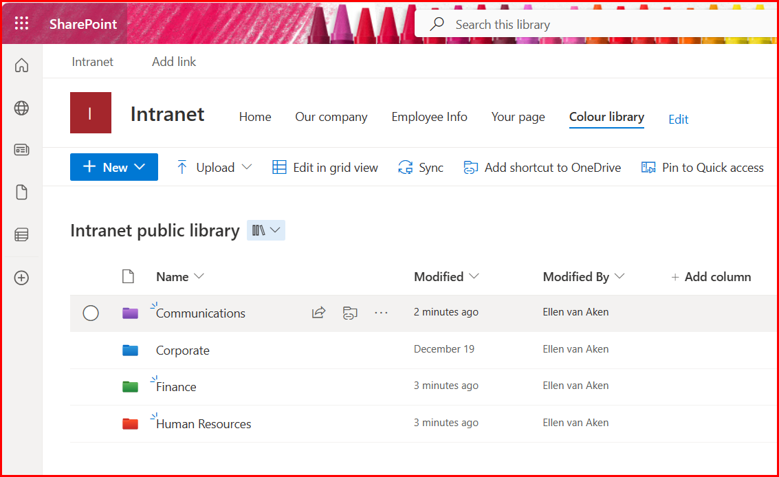
It makes sense to agree on the distribution of colours over the departments in order to be as consistent as possible within your organization. So, all folders containing public Finance documents could be green, all folders containing public HR documents could be red, etc.
Even if it may not be relevant to the entire audience, it can be useful for editors – so your HR officers know they have to upload in red folders.
You can also give all folders in all public SharePoint sites your corporate colour, if available. (At his moment, you are limited to the 16 colours shown, so SaraLee’s red would be an option, but AkzoNobel’s dark blue would not.) That way people will know they are looking at corporate information.
Does anyone know if you can create folders with another default colour than the yellow? I could not find that information.
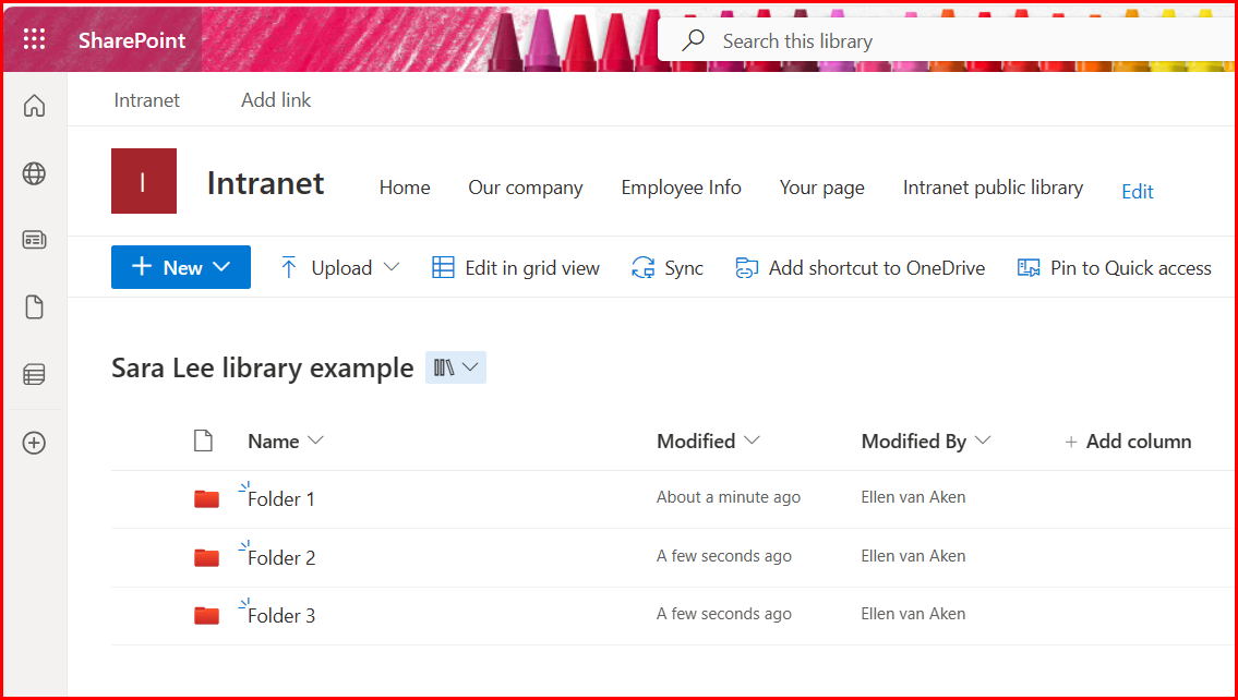
(Please note I don’t know if this can be done at all, and Sara Lee as a company no longer exists)
So, it may be small and trivial feature for some, but it can help people knowing where they are, as long as you use it with some caution.
A few more things to know:
Colour is not metadata so you cannot search, sort or filter on colour. So if you want all folders of a similar colour to be together, you may need to add letters, numbers or a prefix to the labels to get them together.
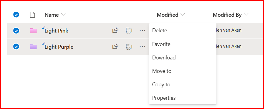
There is no bulk-changing available for folder colours. So in case you want to change colour for multiple folders to the same colour, you have to do it one-by-one.
Unfortunately, you cannot change the colour of a document library. Those libraries will always have that yellow/brown colour. It would be nice if you could change that, too!
Are you using this?
Are you using coloured folders right now, and if yes, how? Please let me know in the comments! Much has been written about it, but I am curious to know how much it is being used.

